Clumpies Ice Cream Co.
25 years of brand longevity - from small batch beginnings to multi-location success

Brand Expression
Food & Beverage
2014
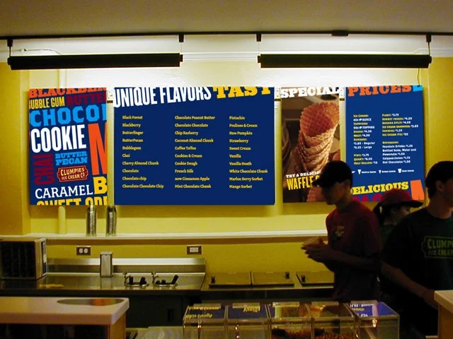
Marshall Brock came to Widgets & Stone with a vision to create a small batch ice cream shop focused on excellent craftsmanship and delightful flavors. His inspiration and guidance was to look to antique dairy farm equipment as we designed the logo and identity, so we did just that. Working closely with Marshall from 1999 to 2013, we built a brand identity that would prove its enduring value over the next quarter century.From 1999 to 2004, Clumpies' look and feel drew heavily on vintage farming catalogs, products and equipment. We utilized John Downer's Brothers and Council font designs from 1999, which were new variations on vintage typography from broadsides and tins that perfectly fit the antique theme. Our work included original stationery sets with letterpress printing and comprehensive sales kits that established the foundation for what would become a beloved local institution.As Clumpies expanded with joint ventures and new locations in 2004, we reimagined the brand style to move brighter, bolder and more playful. We introduced a type-heavy approach that utilized lighthearted writing and added brighter colors to the palette, creating new packaging designs and updated signage and wayfinding for the growing number of locations. In 2013, See Rock City acquired Clumpies Ice Cream Co., and the brand design duties were brought in-house. Even after all this time, the logo and visual identity are still going as strong as ever, a testament to thoughtful design that honors both craftsmanship and community connection.