


Vision,
Made Visible
Made Visible


Start a project
Vision,
Made Visible
Made Visible
Press s anytime to start a project
Work With Us

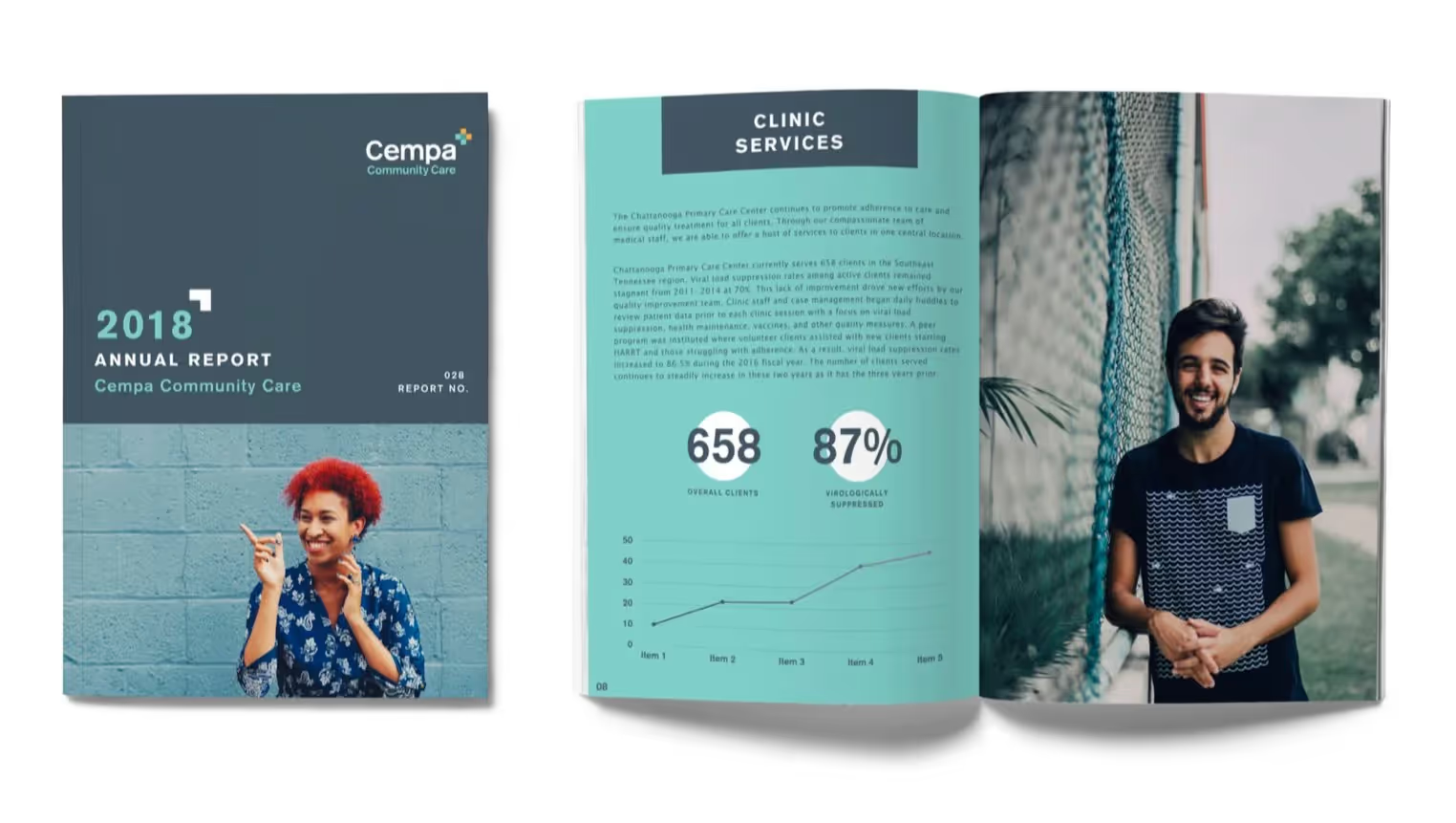
Healthcare Organization Rebrand
Widgets & StoneCreative Direction: Paul RustandDesign Direction: Liz TappDesigner: Mark SlawsonWriting: 26 Tools
Transforming regional healthcare identity to reflect expanded services and growing community impact
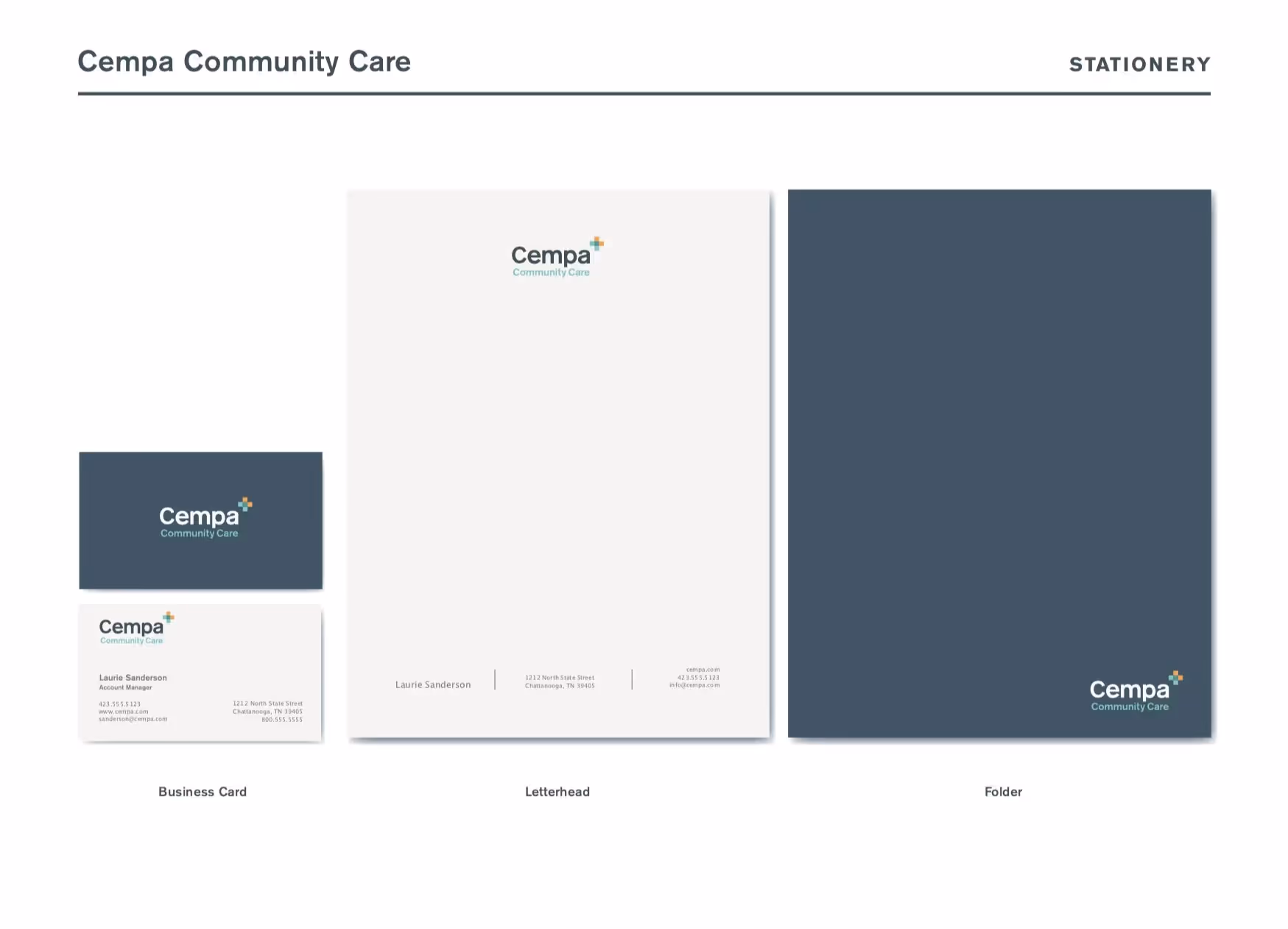
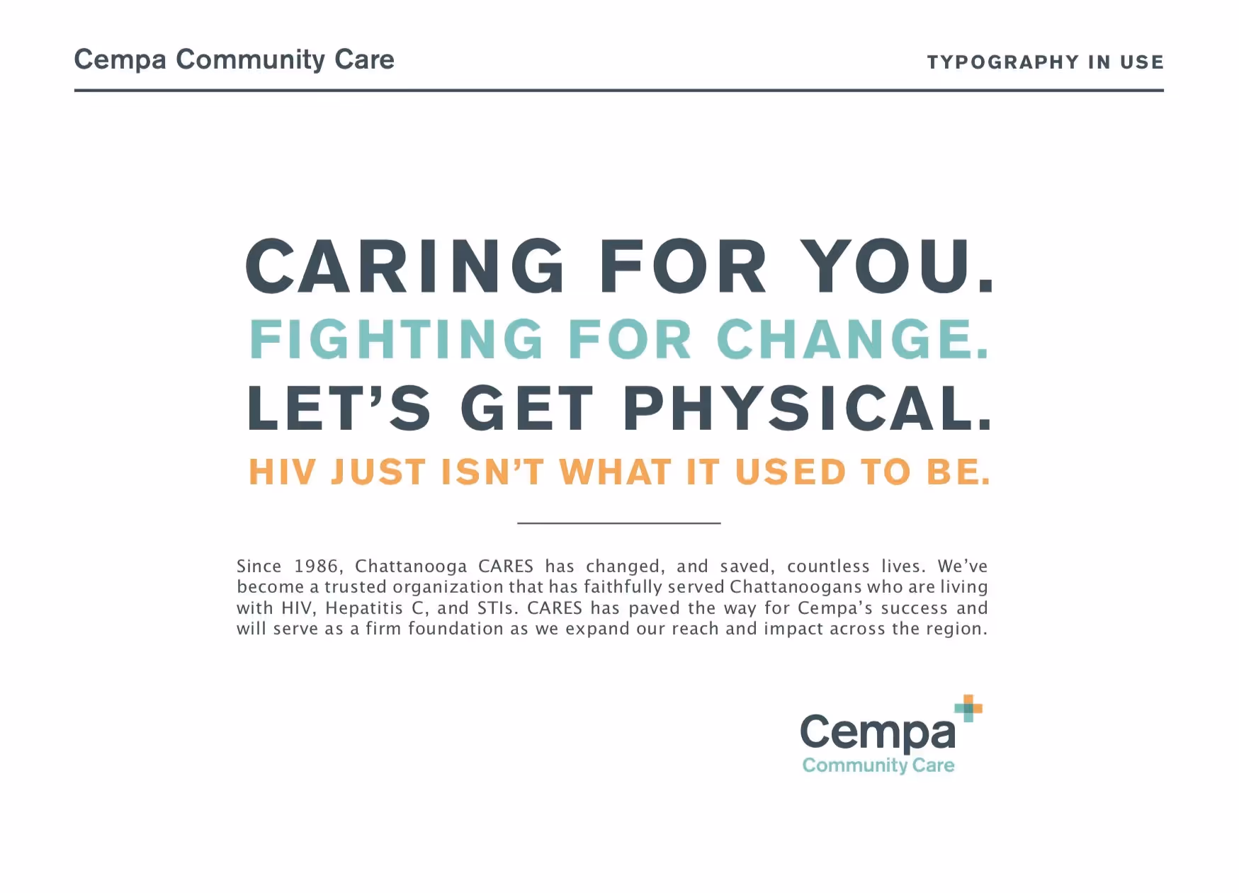
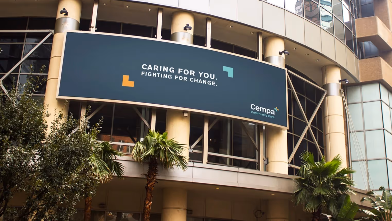
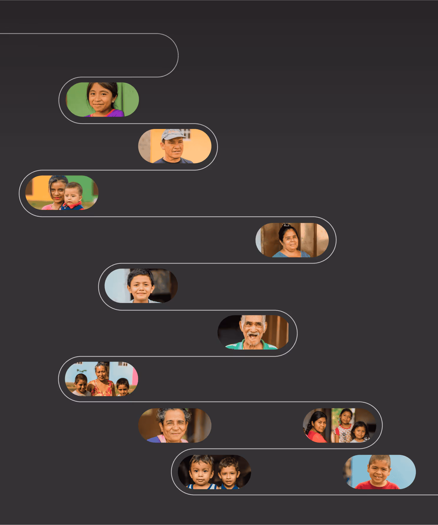
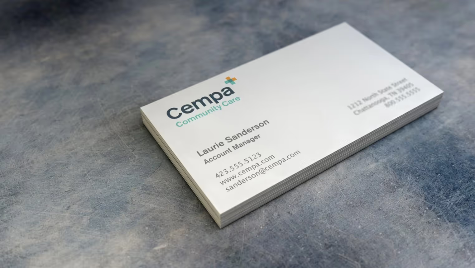
Whiteboard partnered with the Board of Directors to rebrand Chattanooga CARES as they evolved far beyond their original mission. Since 1986, the organization had focused on HIV support, but their services had grown to encompass Hepatitis C, STIs, and comprehensive primary care services across an expanding geographic area. The Board recognized that their growth required a new name and identity that reflected their broadened scope and regional reach. After an extensive naming process, they chose Cempa Community Care, and Whiteboard developed a strong typographic identity that perfectly balanced professionalism with approachability. The design features a medical cross formed by overlapping arrows—symbols that function as both framing devices and representations of movement and progress. The clean visual system combines flat color with warm photography to present complex health information clearly and compassionately. Whiteboard also redesigned the heritage Chattanooga CARES logo for the foundation arm, ensuring brand continuity while embracing organizational evolution.