


Vision,
Made Visible
Made Visible


Start a project
Vision,
Made Visible
Made Visible
Press s anytime to start a project
Work With Us

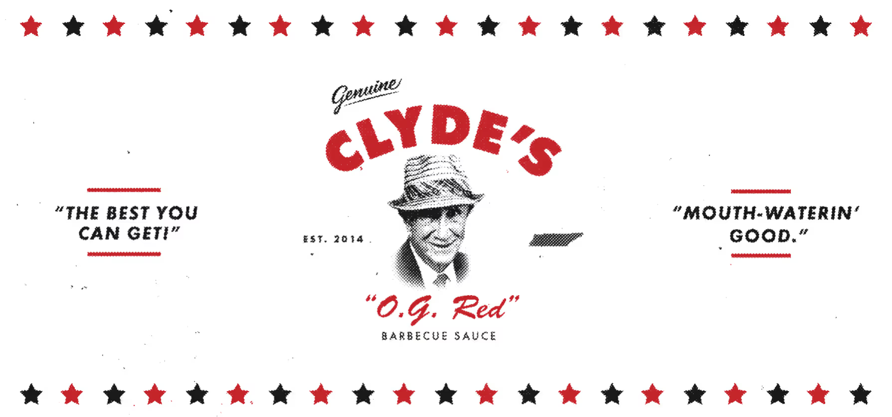
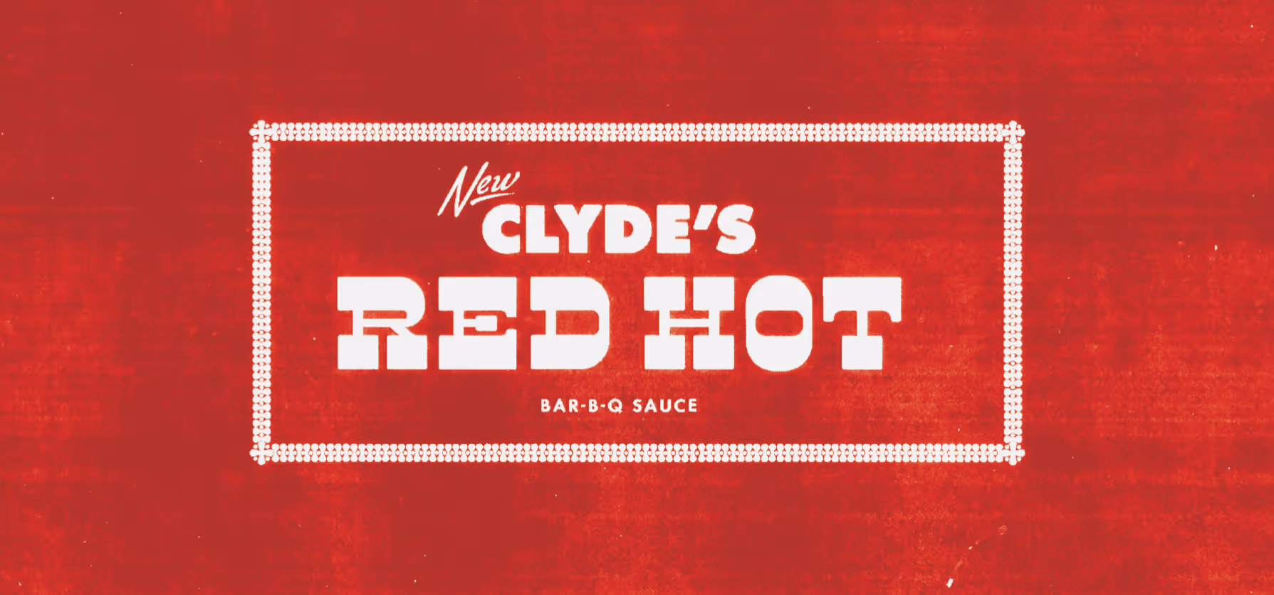
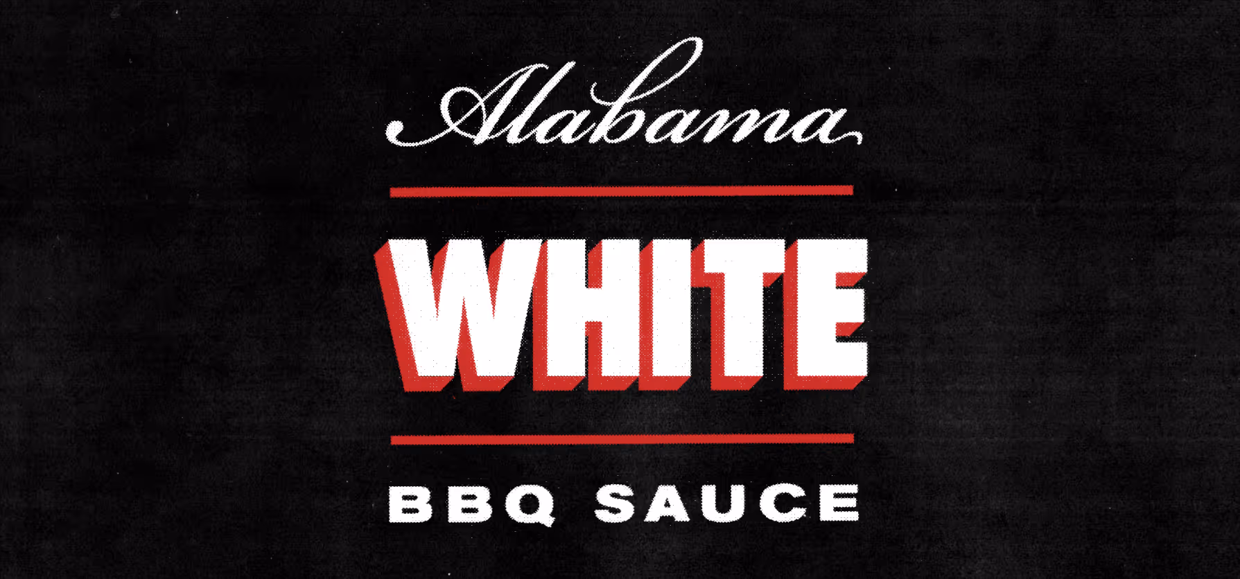
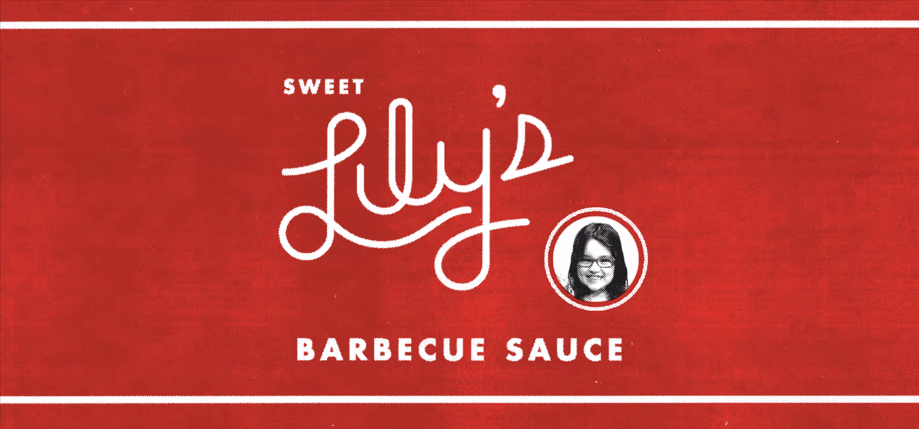
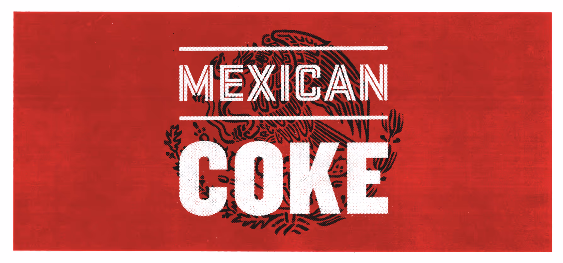
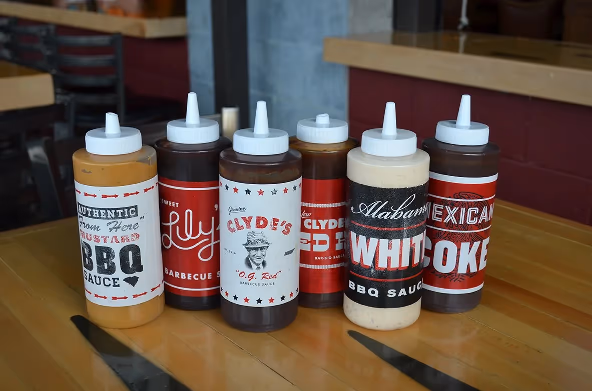
Saucey! - Six distinct BBQ sauce labels celebrating 1980s zine culture
Widgets & StoneCreative Direction: Paul RustandDesign: Ben Dicks, Travis Hitchcock
Label design series for Clyde's six in-house BBQ sauces, drawing inspiration from 1980s xerox zine culture and southern vernacular
Building on the established visual identity for Clyde's on Main, Whiteboard extended the brand personality into product packaging with a series of labels for their six distinctive in-house BBQ sauces. Each label celebrates the eclectic 1980s aesthetic that defines the restaurant, drawing inspiration from xerox "zine" culture and authentic southern vernacular design. The label series transforms what could have been straightforward product packaging into a collection of miniature design statements, each reflecting different aspects of the southern BBQ tradition while maintaining visual coherence across the product line. The playful, irreverent approach to typography and layout captures the spirit of DIY culture while ensuring shelf appeal and brand recognition. This project demonstrates how consistent brand thinking can extend naturally into retail applications, turning everyday products into brand ambassadors.