


Vision,
Made Visible
Made Visible


Start a project
Vision,
Made Visible
Made Visible
Press s anytime to start a project
Work With Us

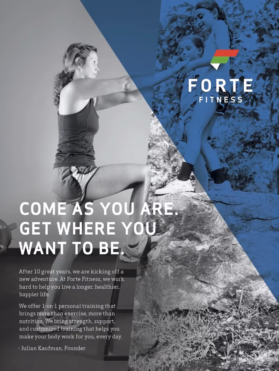
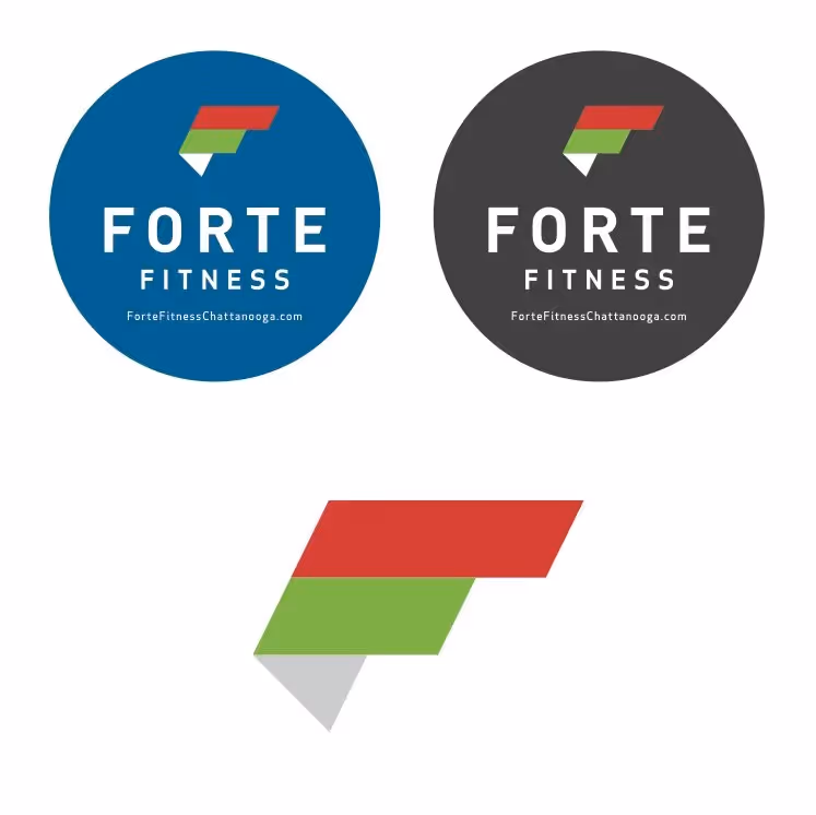
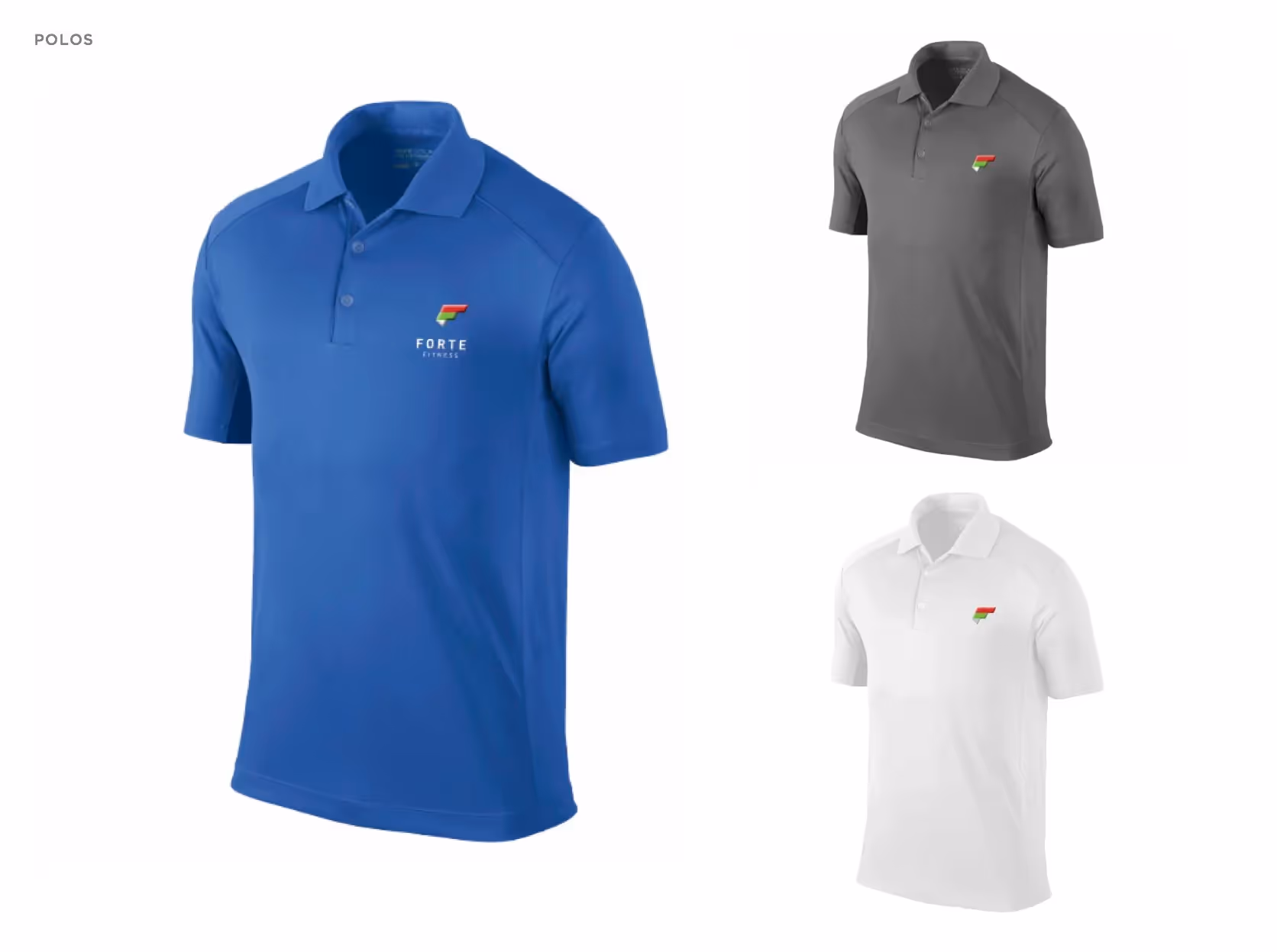
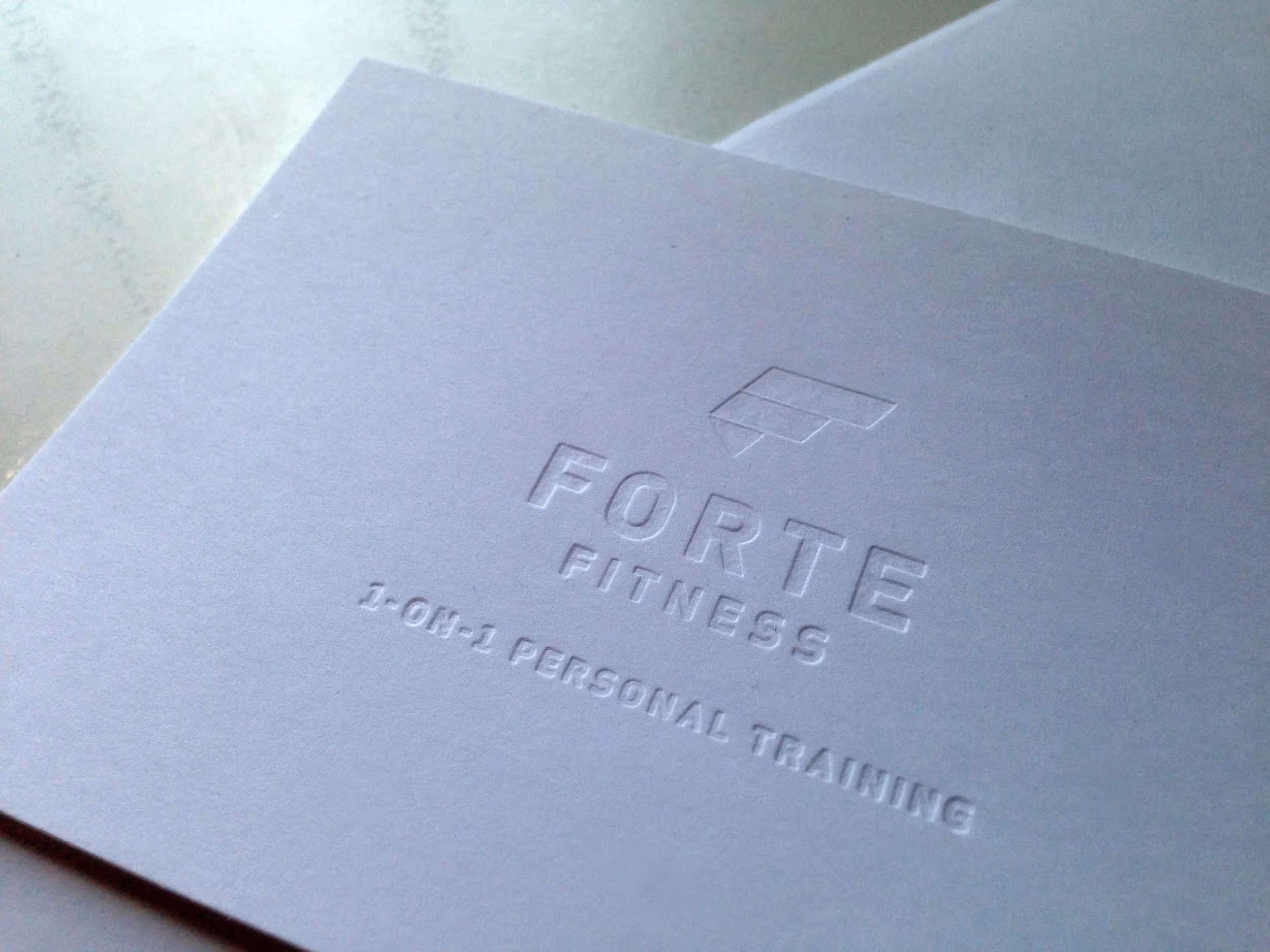
Complete identity for premium personal training studio
Widgets & StoneCreative Direction: Paul Rustand, Mandy MeredithDesign: Amy Trumbull Harmon, Matt Greenwell, Brian WleklinskiWriting: Caleb LudwickPhotography: Dotson Commercial
Brand identity for Italian-inspired personal training studio
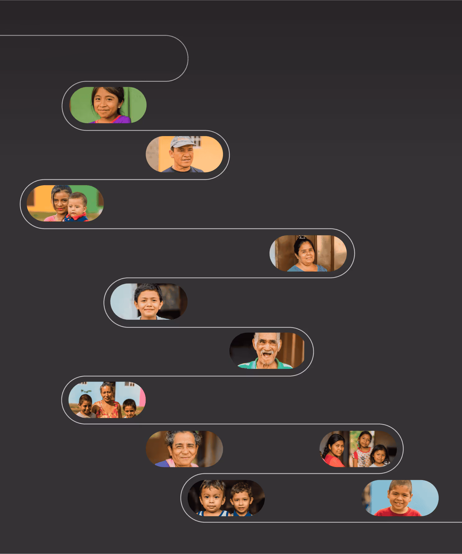
After a decade working for a national franchise, personal trainer Julian Kaufman decided to launch his own fitness studio. Having developed an excellent client base and reputation through years of one-on-one training, Julian partnered with Whiteboard to create an identity reflecting that excellence in his brand communications. Whiteboard collaborated with Caleb Ludwick and Grant Dotson to develop the complete Forte Fitness brand including naming, writing, design, and photography. The name and visual identity drew inspiration from Julian's Italian heritage - Forte means 'strong' in Italian while remaining familiar to English speakers. The Italian flag's colors influenced the logo design, with the azzurri blue of Italy's national teams playing a complementary role in the palette. The black and white photography showcases how training and lifestyle integrate at Forte Fitness, creating distinctive marketplace presence.