


Vision,
Made Visible
Made Visible


Start a project
Vision,
Made Visible
Made Visible
Press s anytime to start a project
Work With Us

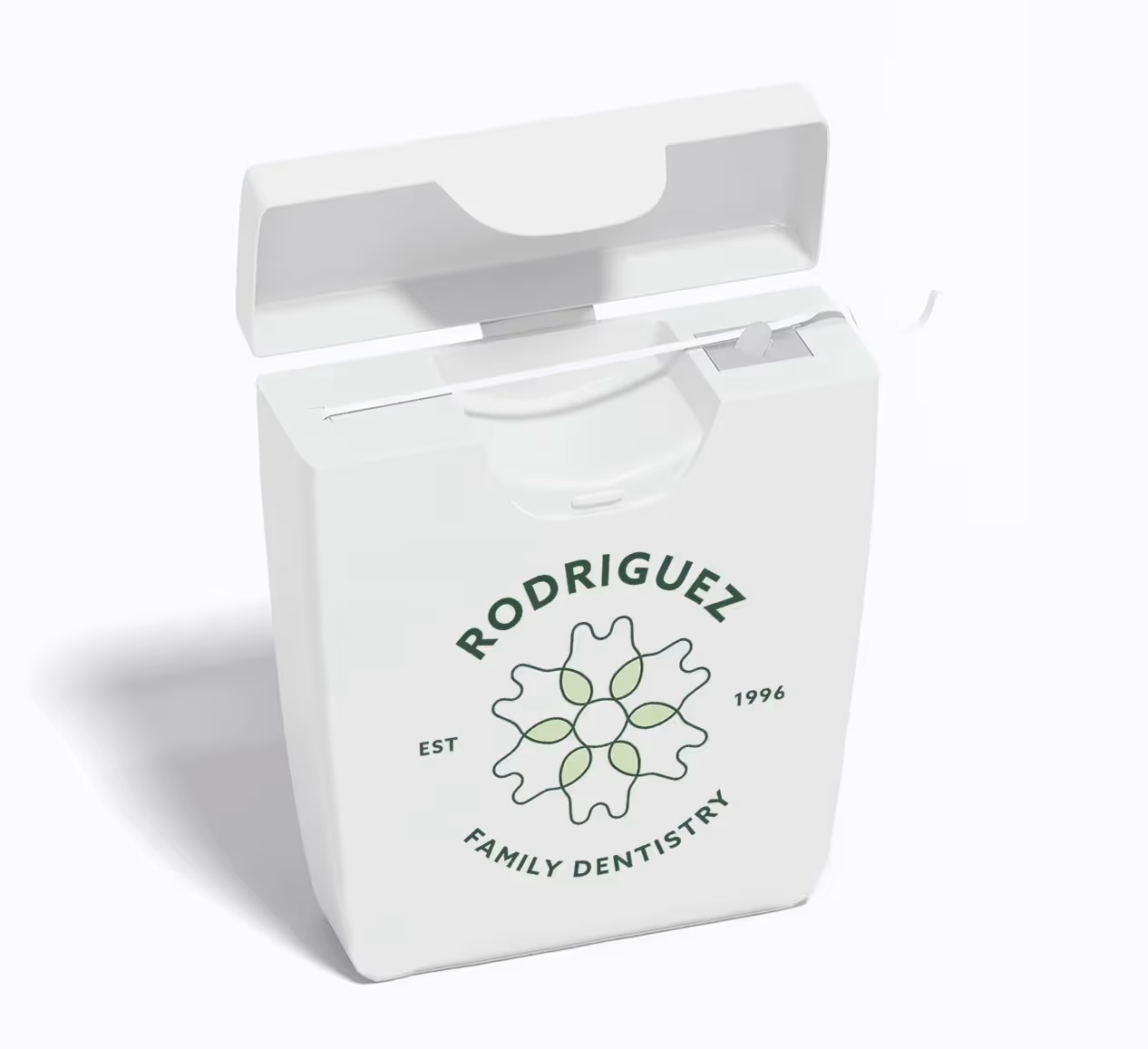
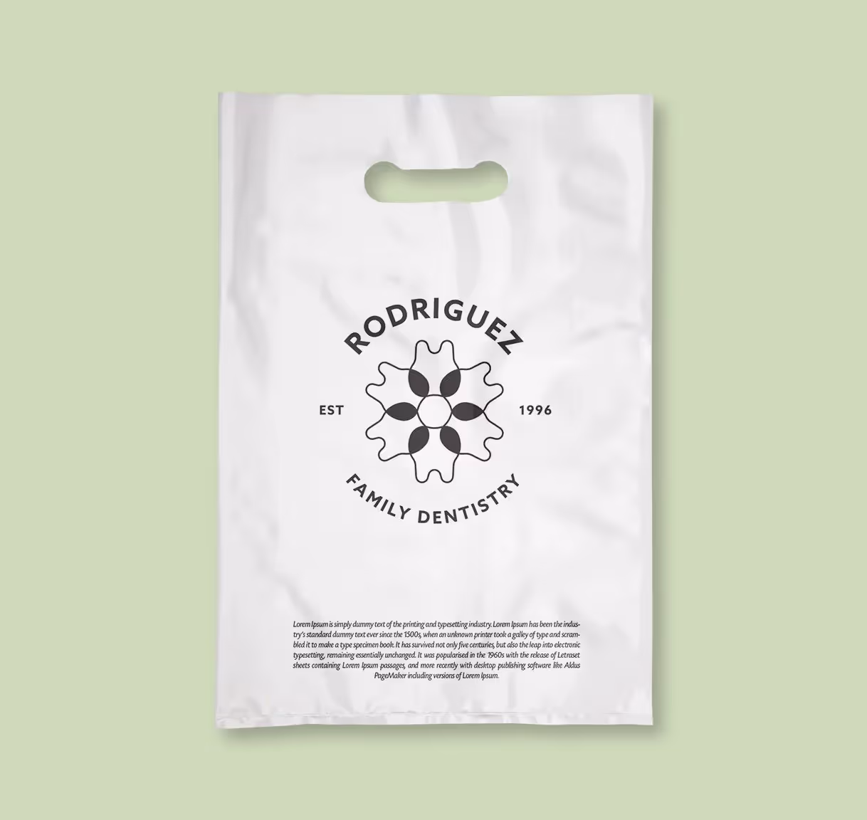
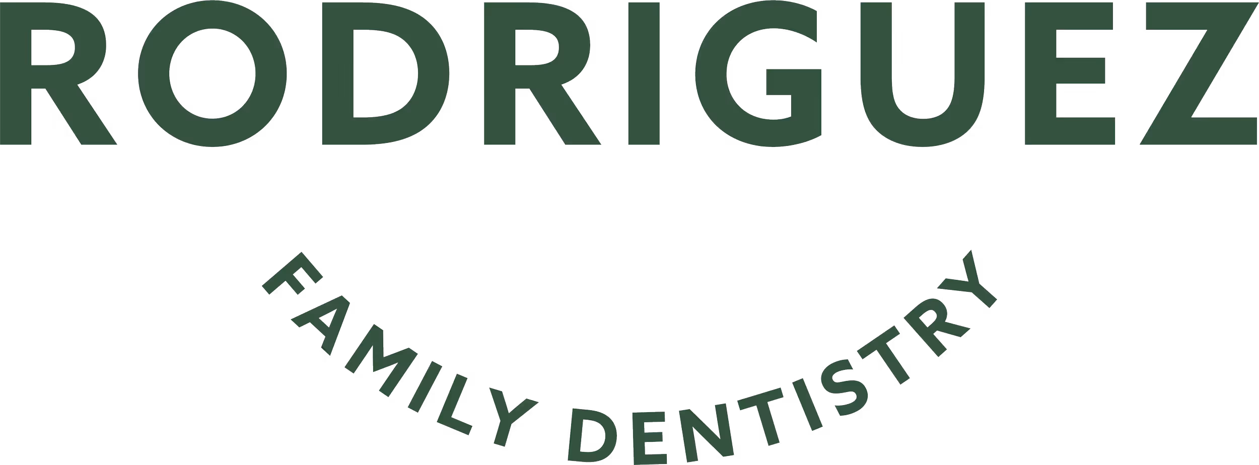
Visual Identity for Expanding Practice
Widgets & StoneCreative Direction: Paul RustandDesign: Emily Ricks
Fresh, modern dental practice branding designed for flexibility and growth
When Dr. Maricela Rodriguez expanded her family dentistry practice to a new location, she needed a visual identity that would communicate the energy and warmth that distinguished her team from typical dental offices. Whiteboard partnered with Rodriguez Family Dentistry to create a brand that would resonate with families while supporting future growth. Our challenge was developing an identity that felt approachable yet professional, memorable yet trustworthy. The solution centered on a flexible visual system grounded in fresh, modern aesthetics. We created the Rodriguez 'flower' symbol featuring overlapping linear petal shapes playfully crafted from iconic tooth forms. The bold, all-caps brand typeface increases legibility and structure, while the looping nature and warm color palette of the logomark counterbalance with softness and whimsy. Anticipating future partnerships or ownership changes, we built flexibility directly into the design, allowing the logomark to function independently of the surname. This strategic approach ensured the brand could evolve with the practice while maintaining its distinctive character.