


Vision,
Made Visible
Made Visible


Start a project
Vision,
Made Visible
Made Visible
Press s anytime to start a project
Work With Us

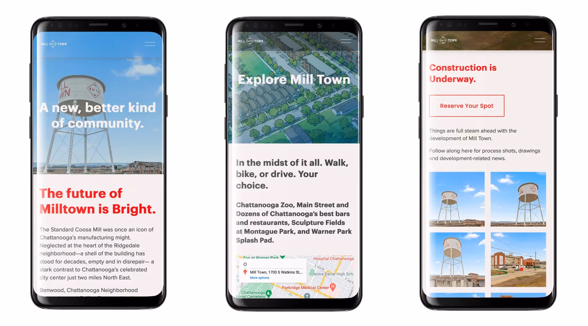
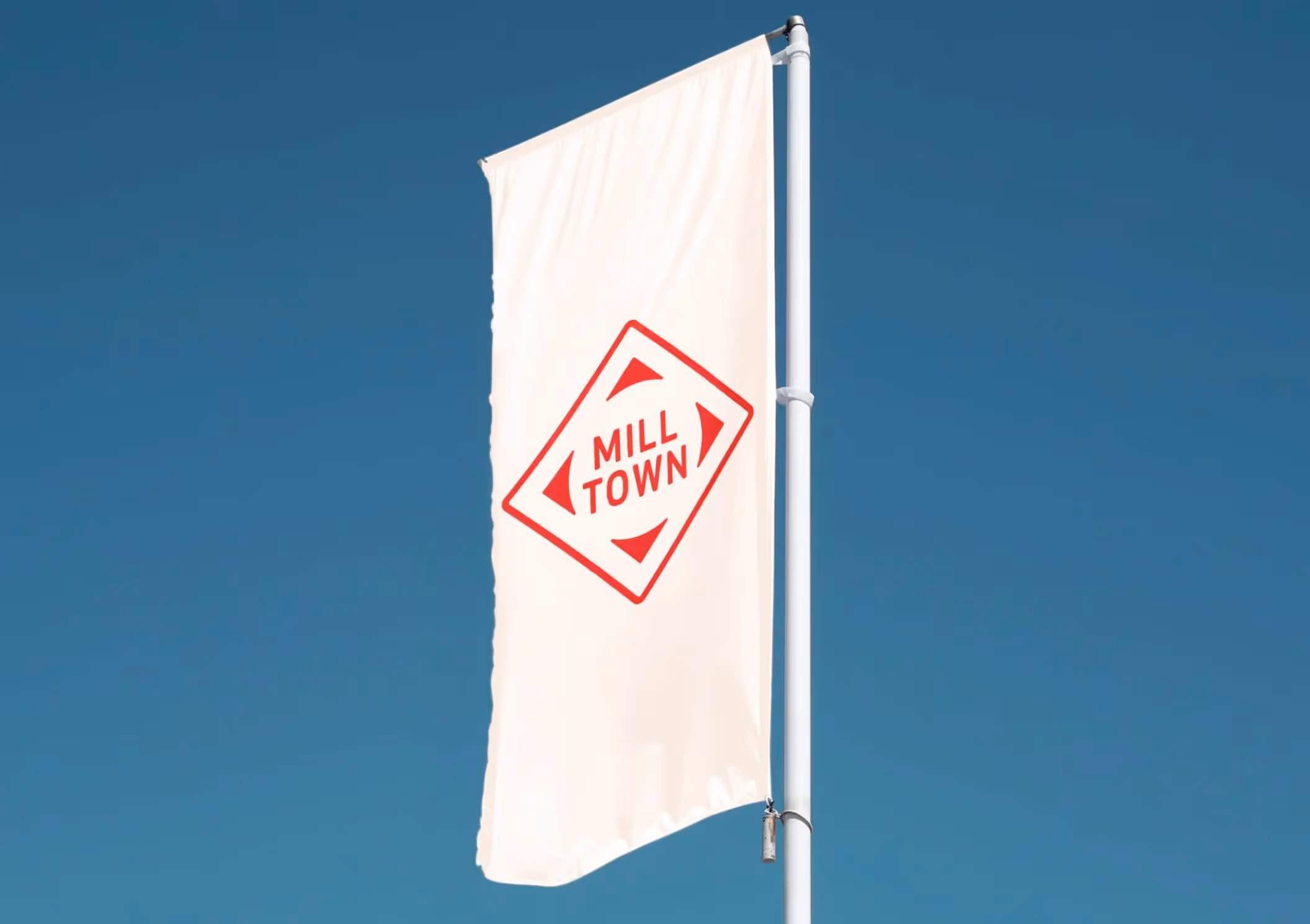
Brand Design for Mill Town Development
Widgets & StoneCreative Direction: Paul RustandDesign Direction: Matt GreenwellDesign: Matt Greenwell, Mark Slawson, Emily Ricks, Liz Tapp, Noah Marlowe
Comprehensive branding for mixed-use development revitalizing historic mill site
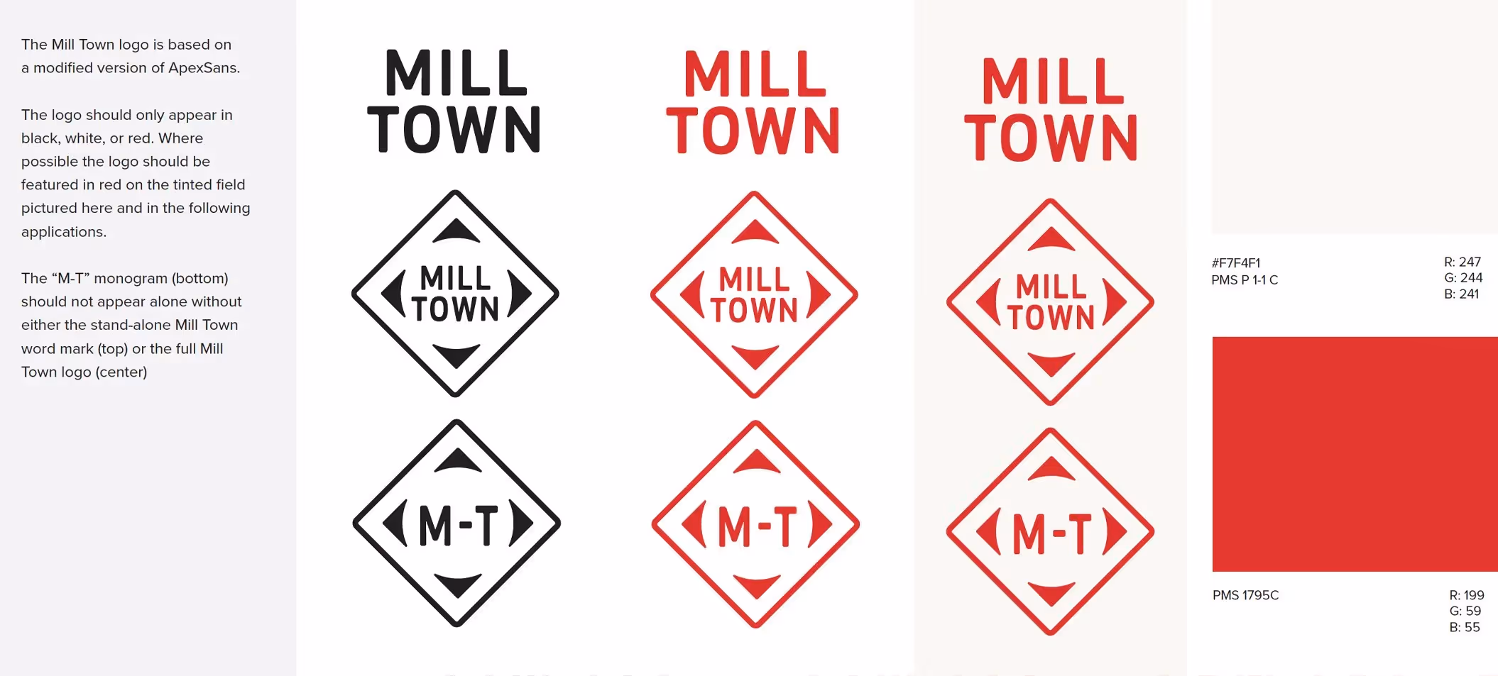
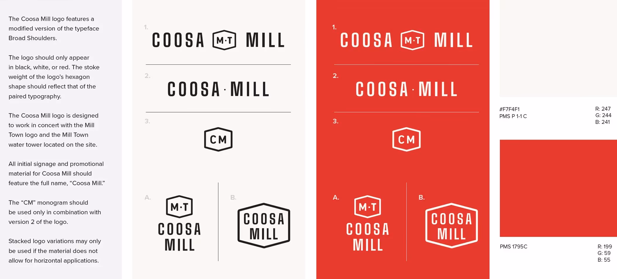
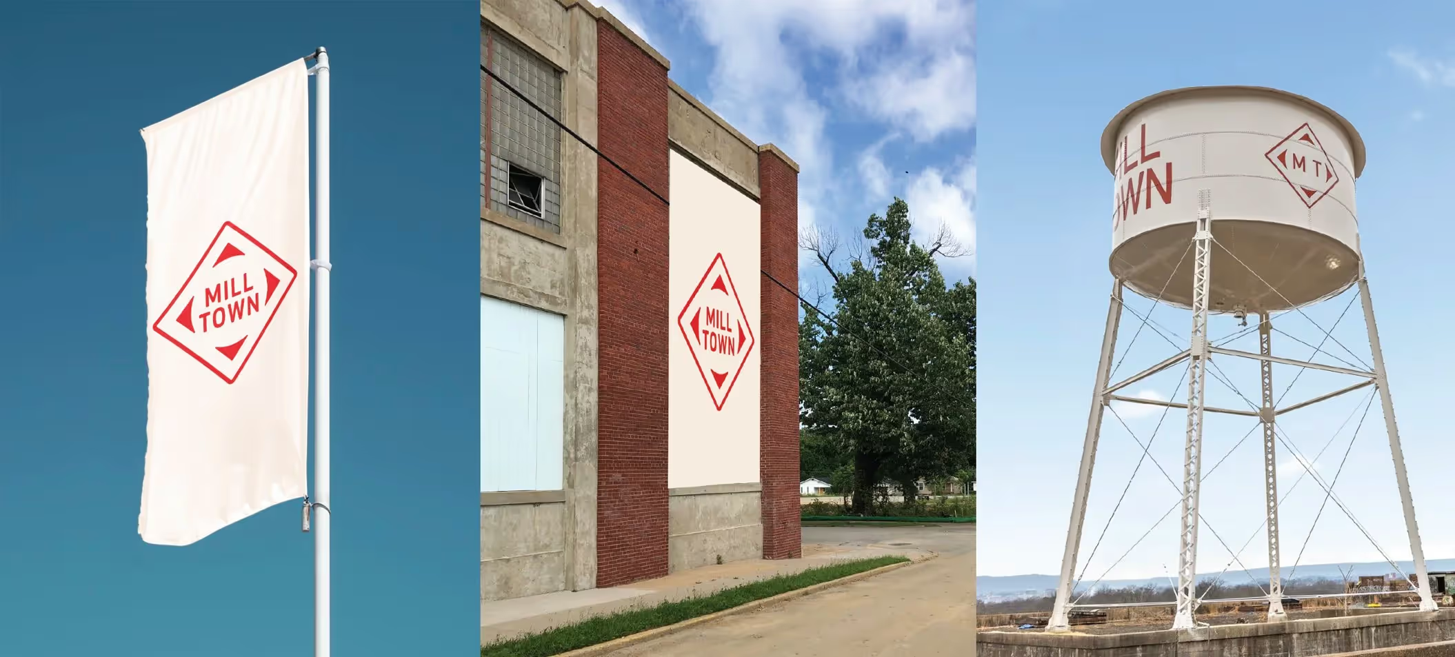
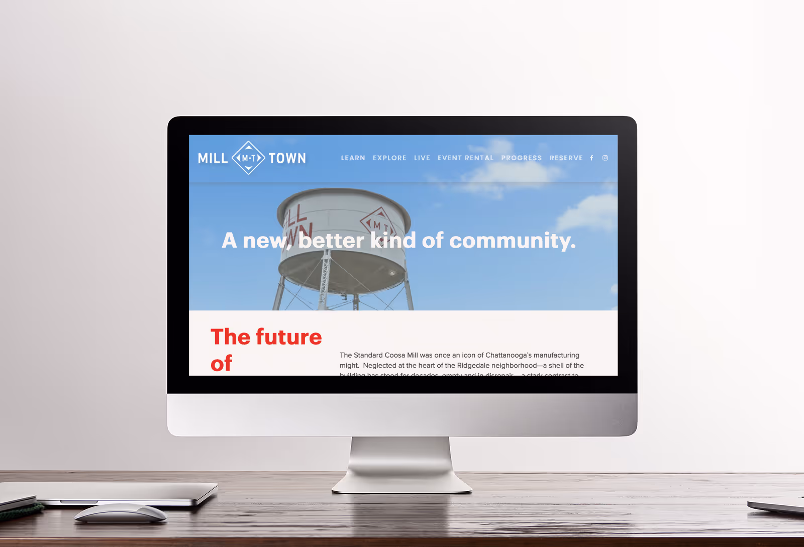
The Standard Coosa Mill once stood as an icon of Chattanooga's manufacturing might. For decades, the neglected structure at the heart of the Ridgedale neighborhood served as a stark reminder of industrial decline—a sharp contrast to the celebrated city center just two miles northeast. When Benwood, Chattanooga Neighborhood Enterprise, and Collier Construction formed a partnership to revitalize this abandoned 20-acre parcel, Whiteboard partnered with them to create an identity worthy of this transformative vision. The challenge was developing names and branding for both the overall mixed-use development and the restored factory building that would honor the site's industrial heritage while embodying its sustainable future. Our approach drew inspiration directly from the location's history and architecture. The diamond shape of the defunct Standard Coosa Thatcher Mill provided the foundation for the Mill Town mark, while bright, bold colors and typography were selected to stand out in the environment. For the anchor structure, we created the Coosa Mill identity, with the refurbished water tower inspiring the abstracted geometric enclosure that mirrors the Mill Town logo's geometry.