


Vision,
Made Visible
Made Visible


Start a project
Vision,
Made Visible
Made Visible
Press s anytime to start a project
Work With Us

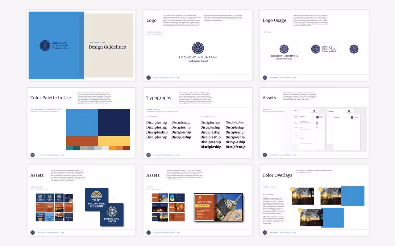
Identity refresh preserving beloved rose window symbol

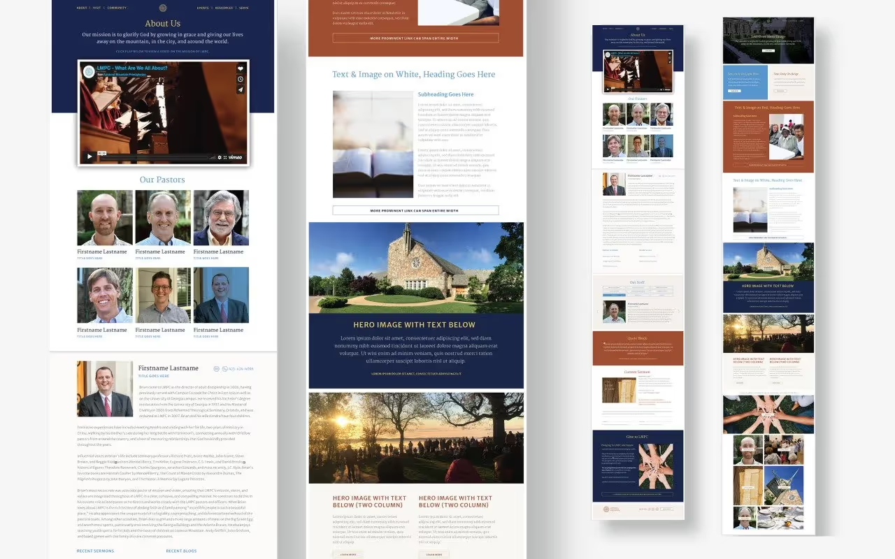
Widgets & StoneCreative Direction: Paul RustandArt Direction: Mark WalterDesign: Brad Dicharry, Emily Ricks, Mark Walter, Noah MarlowePhotography: LMPCWeb Development: John Reeder
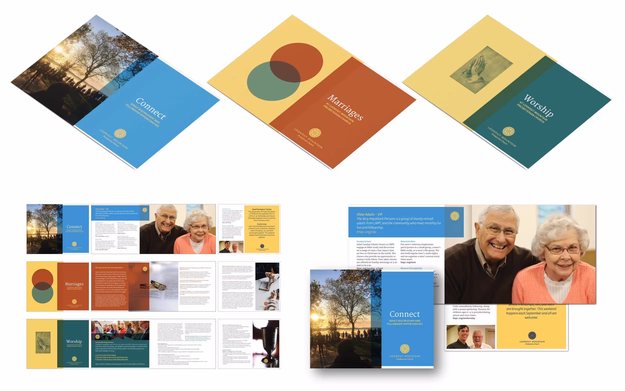
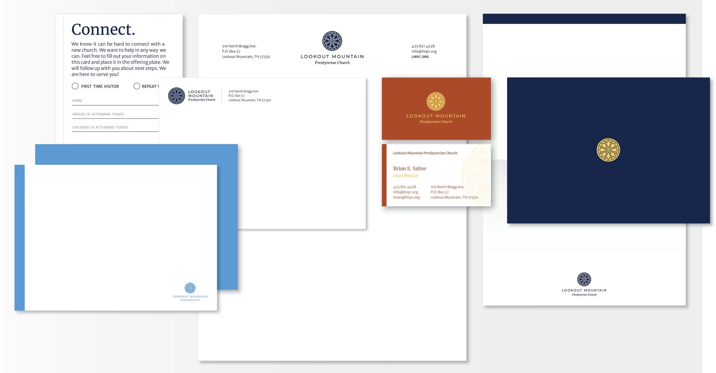
Six-year identity update maintaining heritage while modernizing communication tools
Whiteboard partnered with Lookout Mountain Presbyterian Church to thoughtfully refresh their visual identity, building on the strong foundation created by former designer Benjamin Dicks in 2015. After serving the church faithfully for over six years, the original identity needed updating to meet evolving communication needs while preserving the beloved rose window symbol that had become central to the church's visual recognition. Communications Director Anna Moyle sought a refresh that would honor the existing heritage while providing more flexible design tools for modern church communications. Our approach preserved Ben's elegant rose window symbol while updating typography and color palette, creating a more versatile system that could adapt across multiple applications. We developed an alternate reversed approach with the symbol appearing in a solid circle, expanding usage options significantly. The comprehensive update included stationery, documents, brochures, television displays, podcast graphics, and a custom icon set. Working with web developer John Reeder, we created extensive web module designs and style guidelines. Most importantly, we provided working templates and comprehensive design guidelines, empowering the communications team to implement the refreshed identity consistently across all church touchpoints.