allwhere

Automating the IT Asset Lifecycle
with a Human Touch
A Delightful Platform for a Distributed World
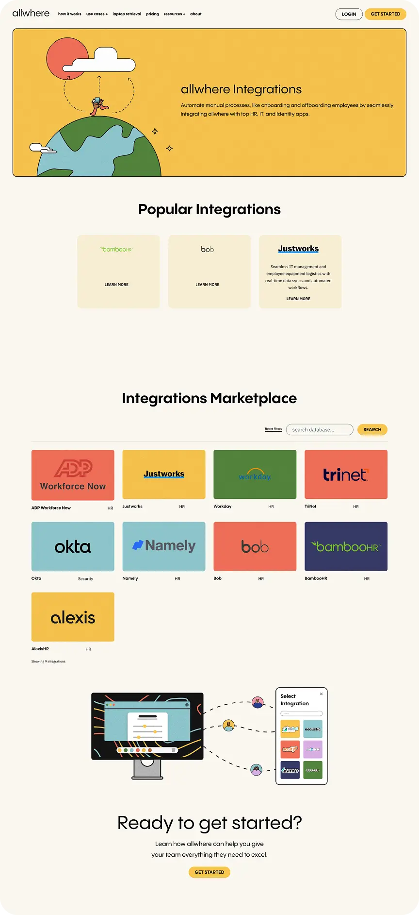
Allwhere exists to make it easy for distributed companies to care for their people well. They streamline the IT asset lifecycle—handling procurement, onboarding, retrievals, and more—so companies can stay focused on what matters most. But as they grew from early-stage startup to scaling SaaS platform, their web presence couldn’t keep up. Their existing site didn’t reflect their full value or resonate with their evolving audience of IT and operations leaders. That’s where we came in.

Web Strategy
Web Design
Web Development
Startup
2025
Evolving the Brand Without Reinventing It
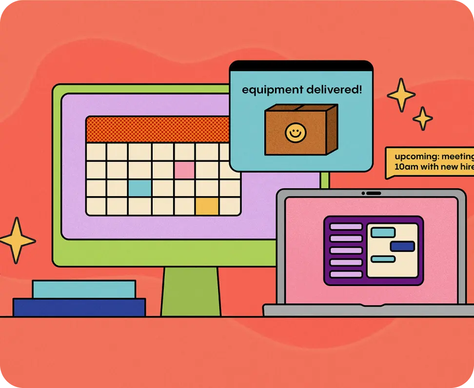
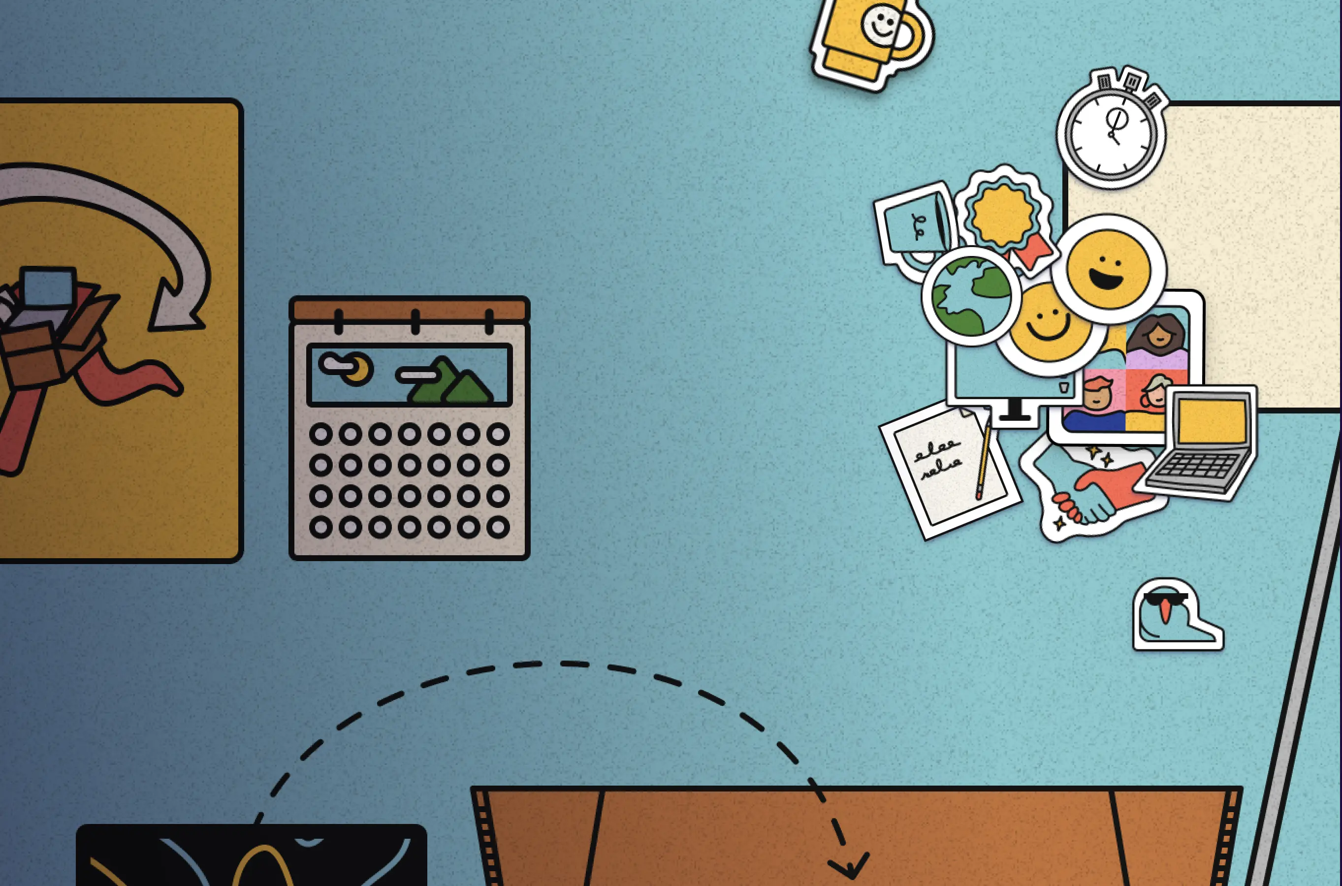
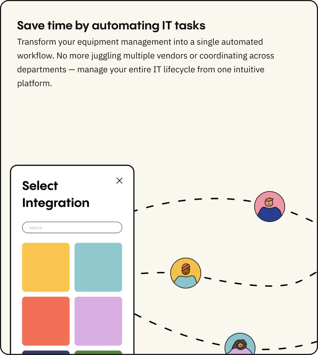
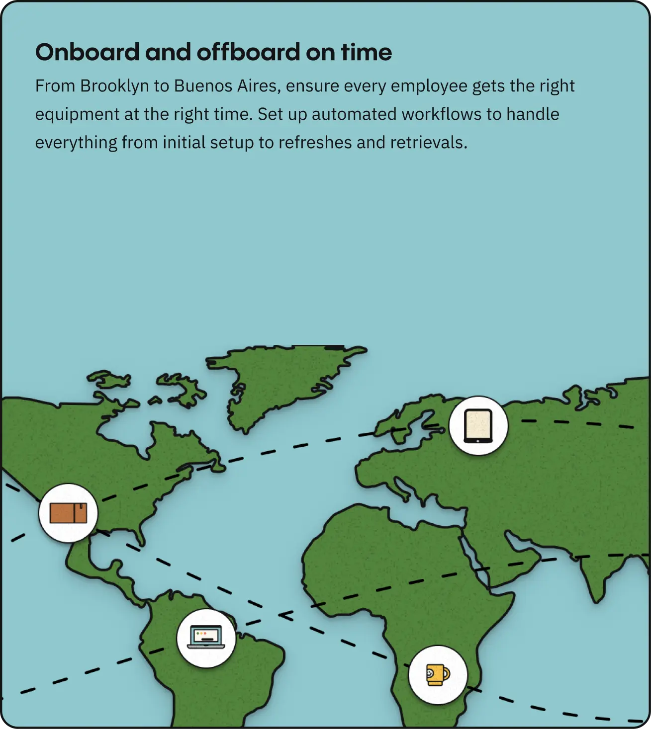
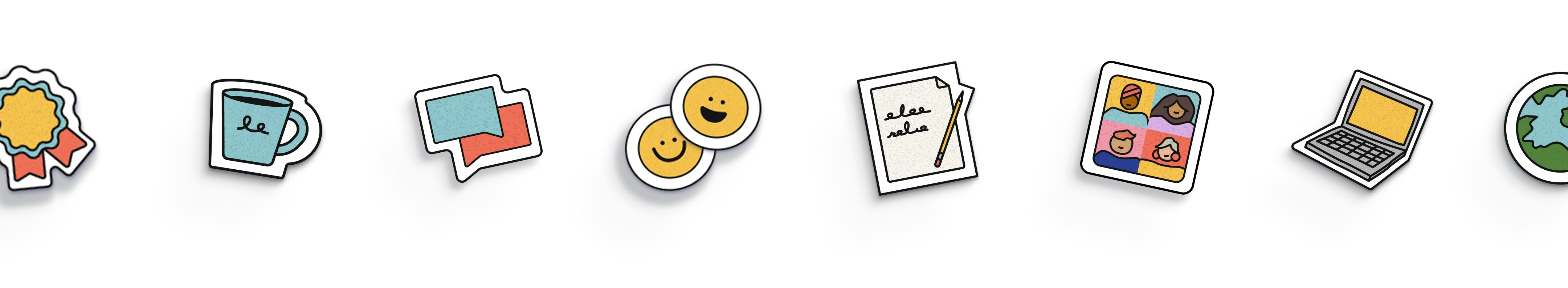
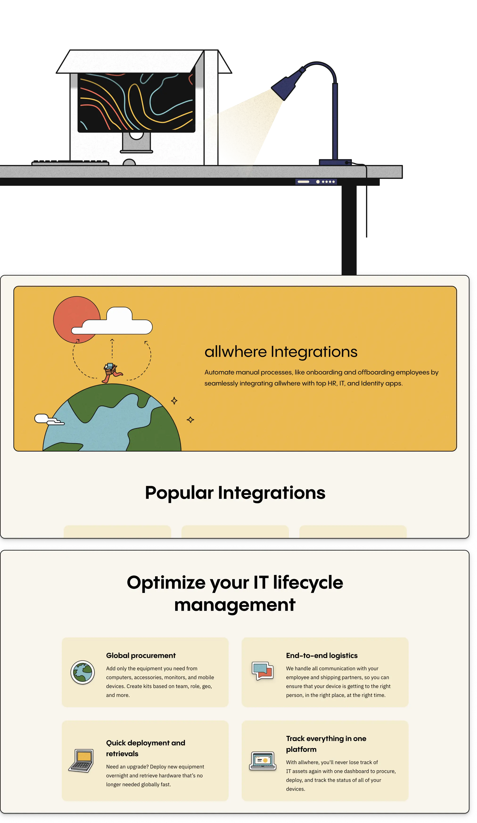
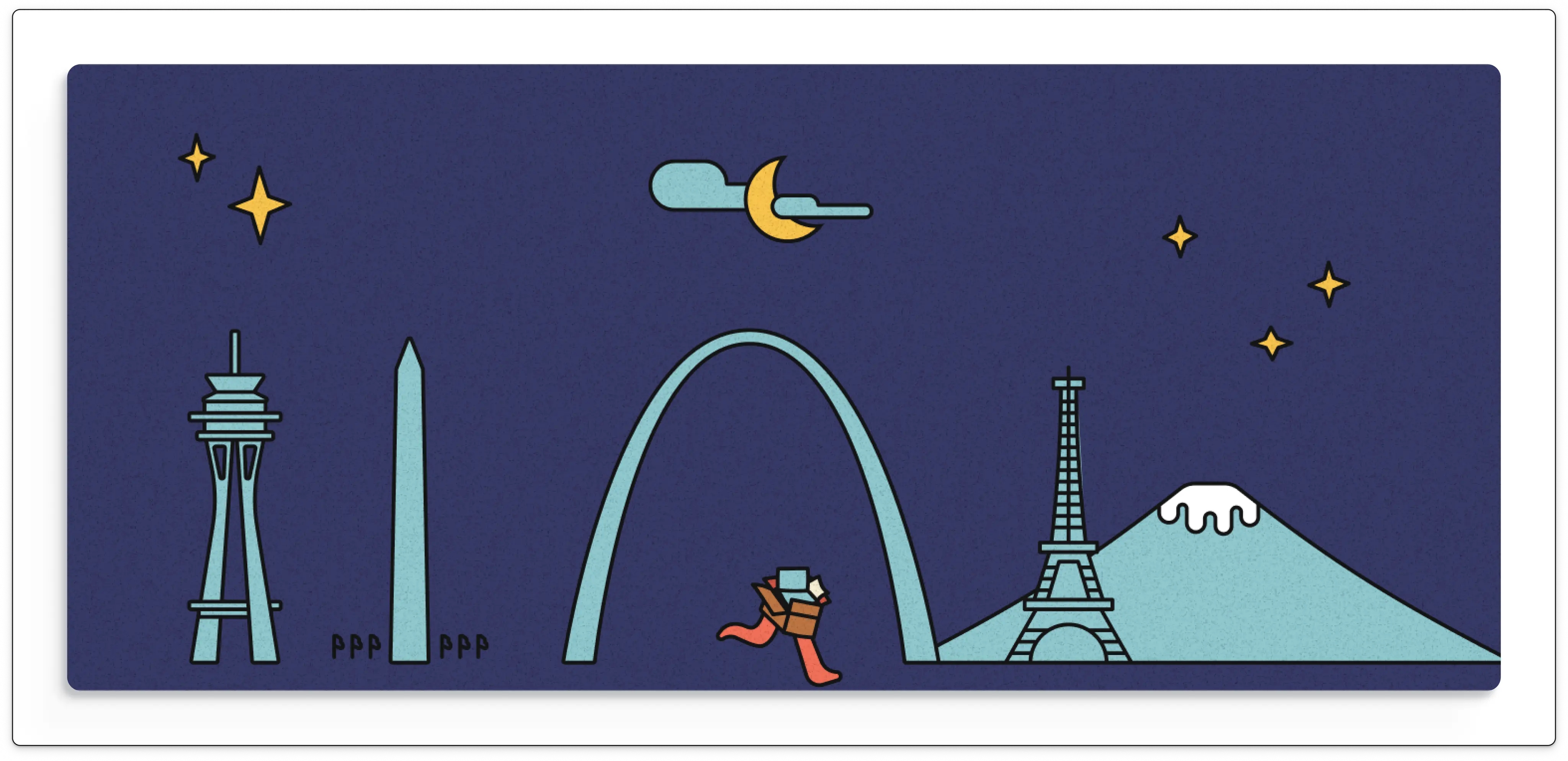
Allwhere entered our partnership with a brand system already in place—bold typography, a fresh color palette, and a distinctive illustration style. Our role was to translate and extend those brand elements into a digital experience that felt cohesive and purposeful. We helped standardize the type system, streamline the color hierarchy, and apply the illustration system in more expressive, strategic ways. One of the biggest wins was taking an illustrated shipping box and turning it into a playful mascot—adding warmth and personality across the site.


A Relationship Rooted in Trust and Agility
We joined Allwhere shortly after their rebrand and name change, stepping in as one of their earliest partners during a critical season of growth. From the start, our approach was defined by agility. While our relationship eventually transitioned into a retainer-based support model, our engagement began with a sprint-based, iterative process. We launched the highest-priority pages first—like the homepage and services overview—and gradually built out the full site from there. This flexible, collaborative rhythm allowed us to keep pace with Allwhere’s evolving needs while staying focused on meaningful outcomes.
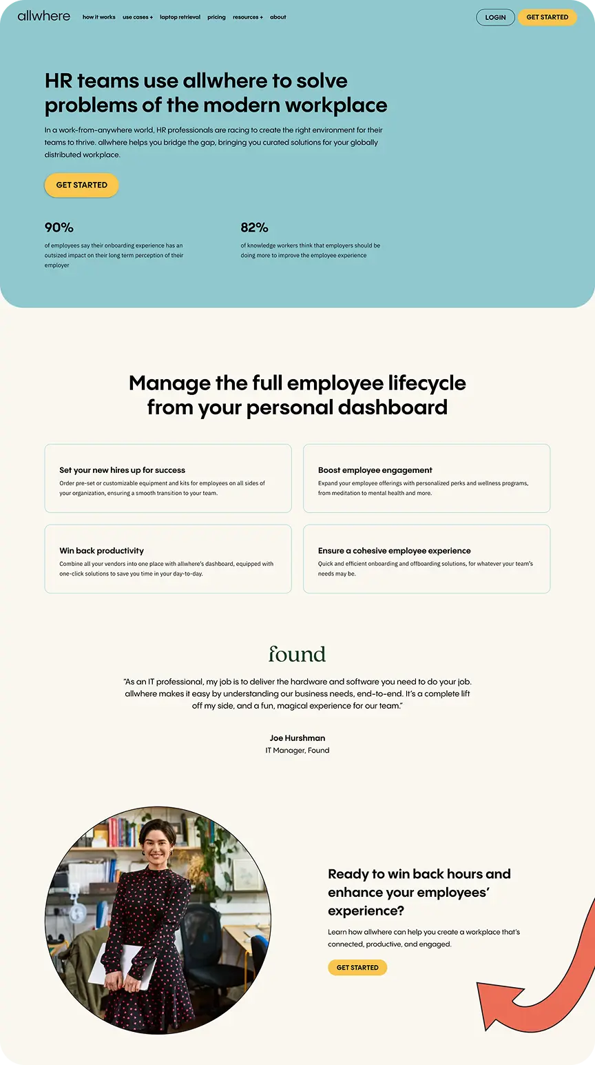
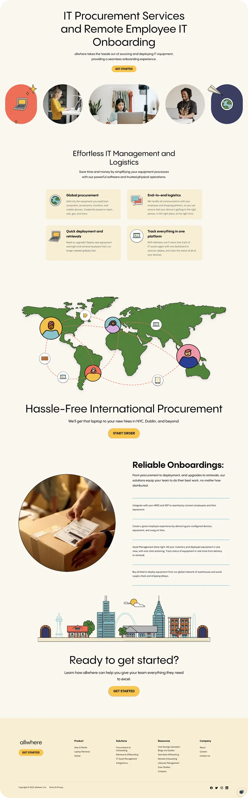


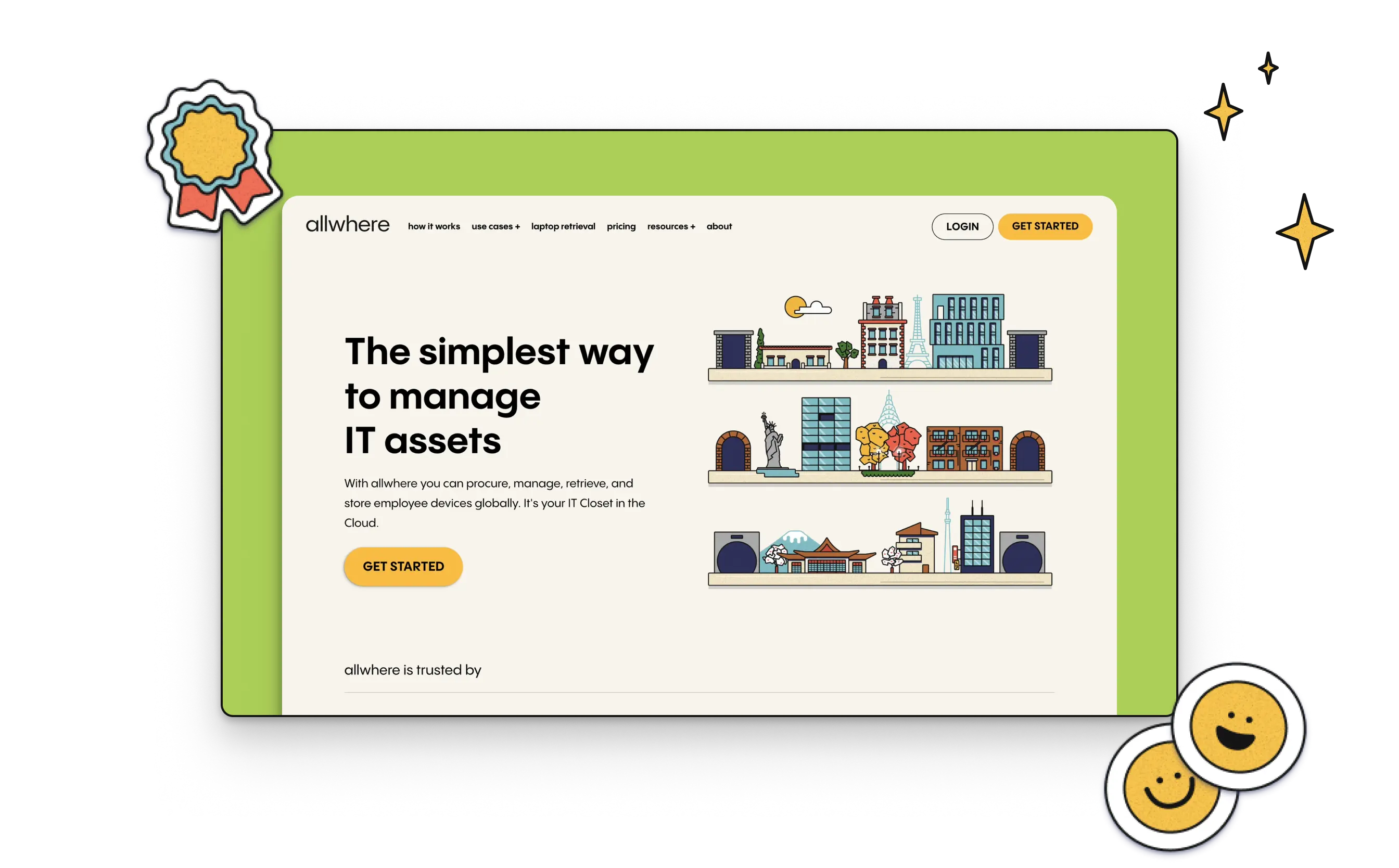
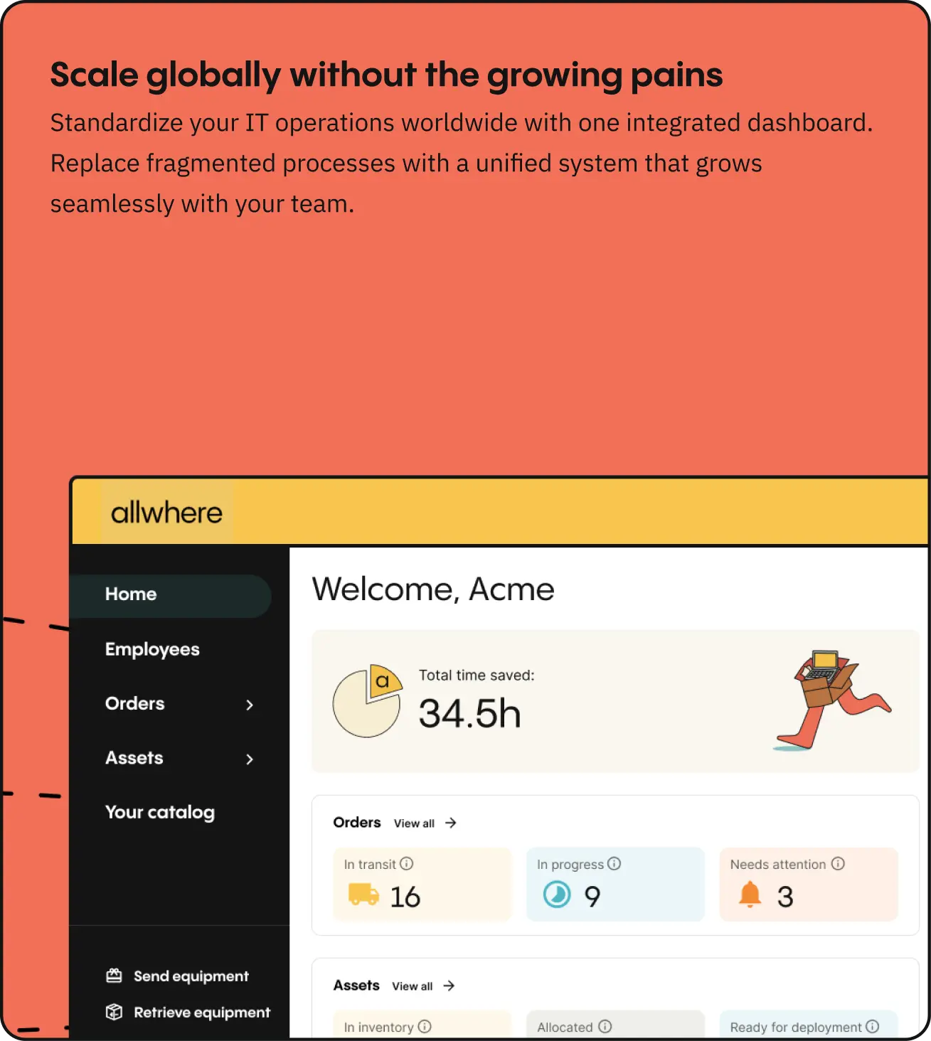
Redefining the Digital Experience
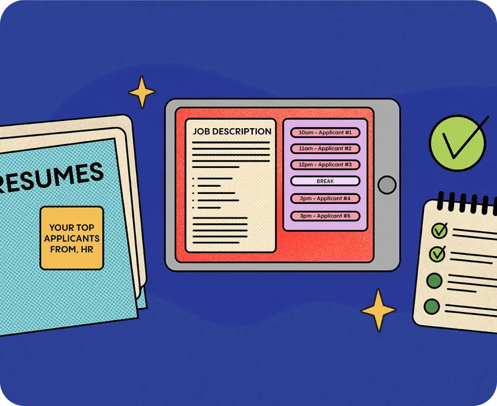
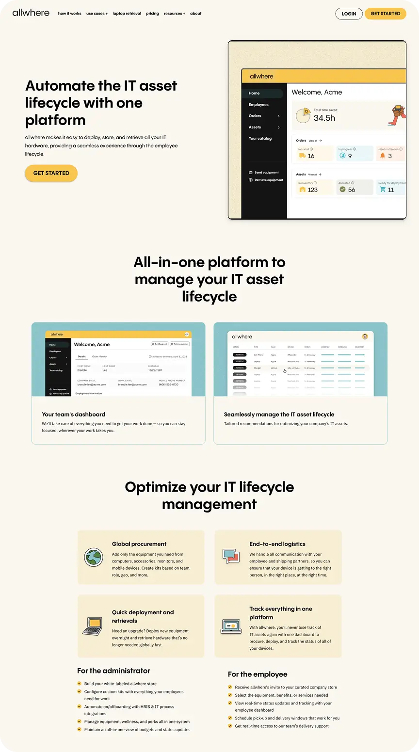
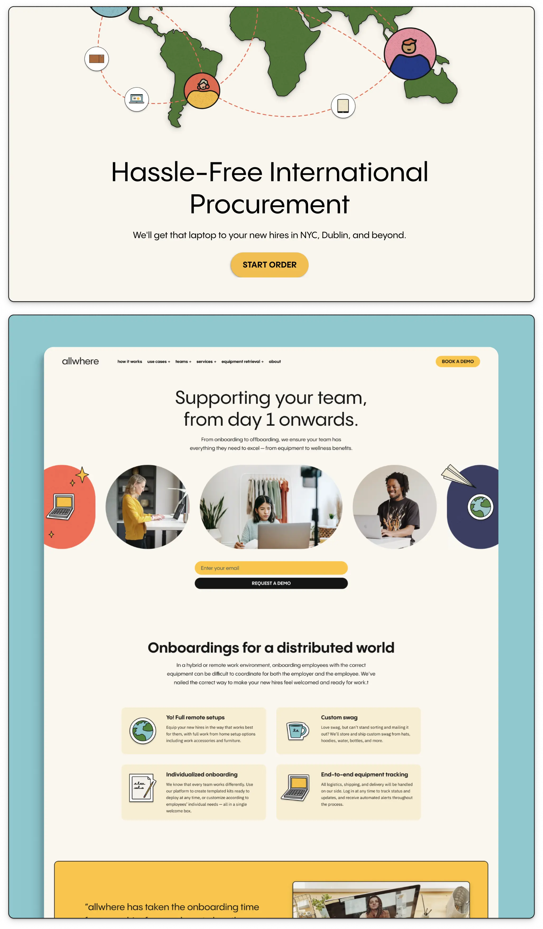
As we moved through each sprint, we reimagined Allwhere’s web presence to better communicate their offering. This included redesigning the homepage, services pages, and a restructured “How It Works” section to speak more directly to IT decision makers. We worked to make the user journey intuitive, educational, and aligned with the new brand—balancing technical clarity with a welcoming, human feel. The result was a site that could scale with Allwhere’s business while clearly articulating what they do and why it matters.
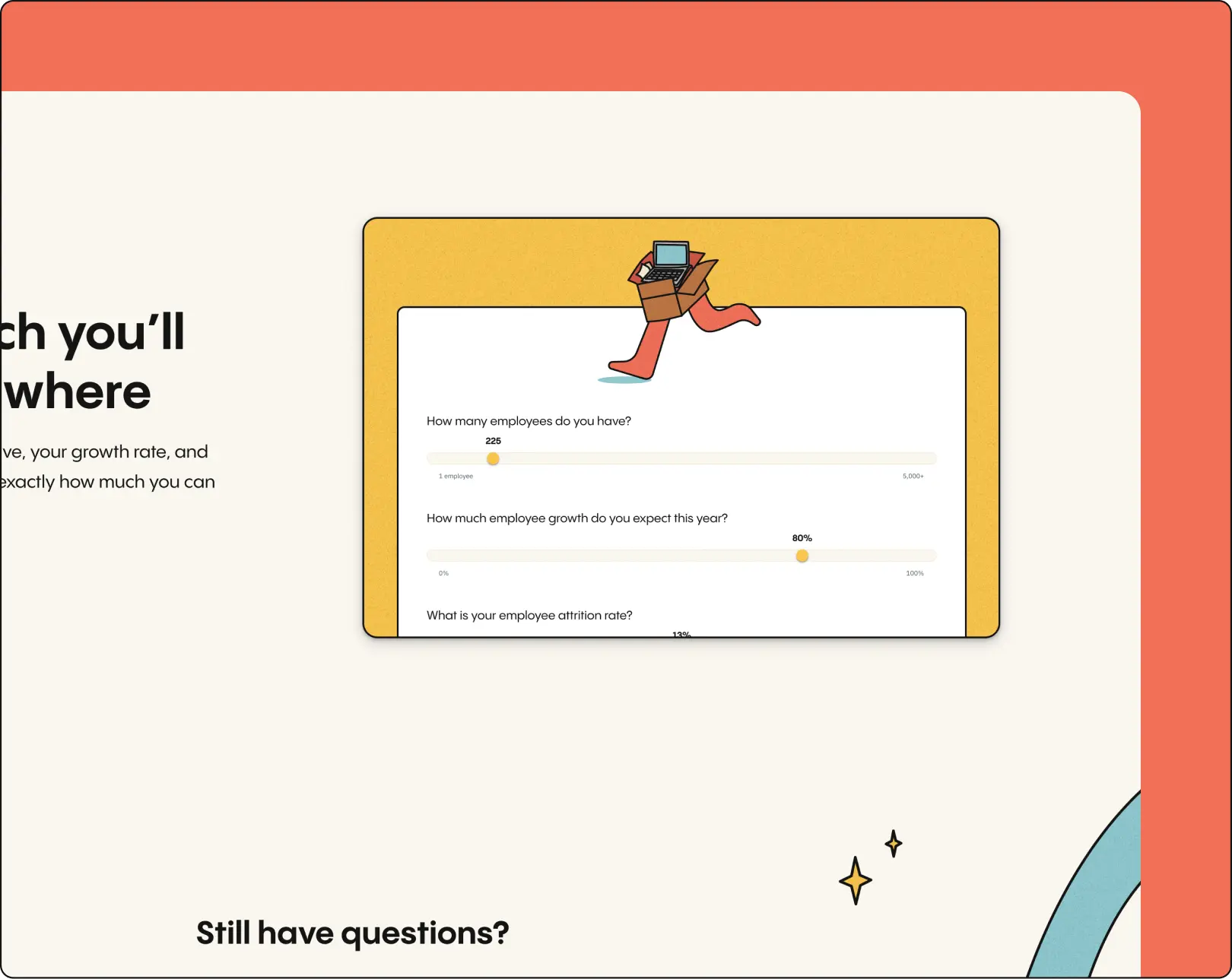
Designing for
Delight and Clarity
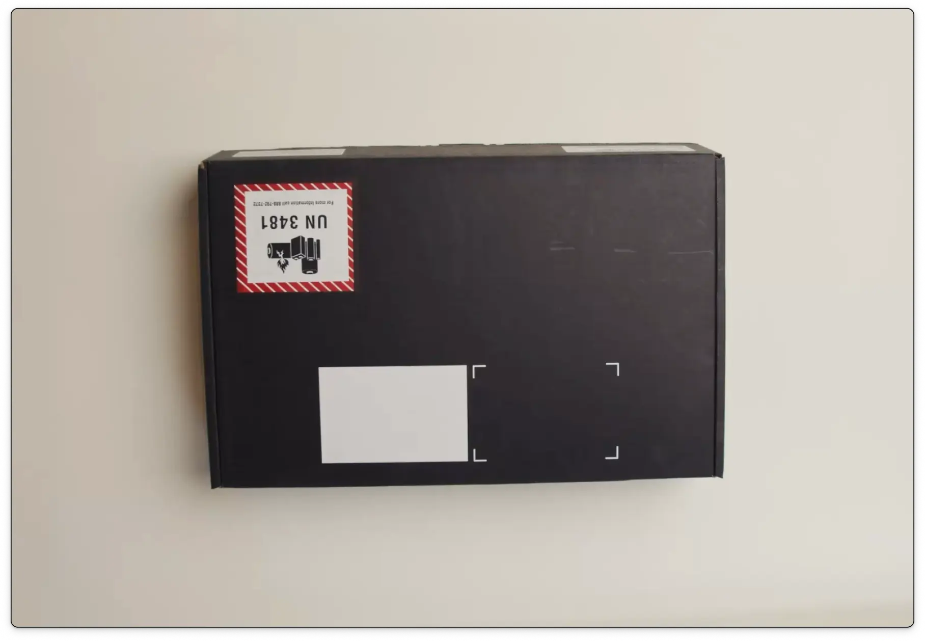
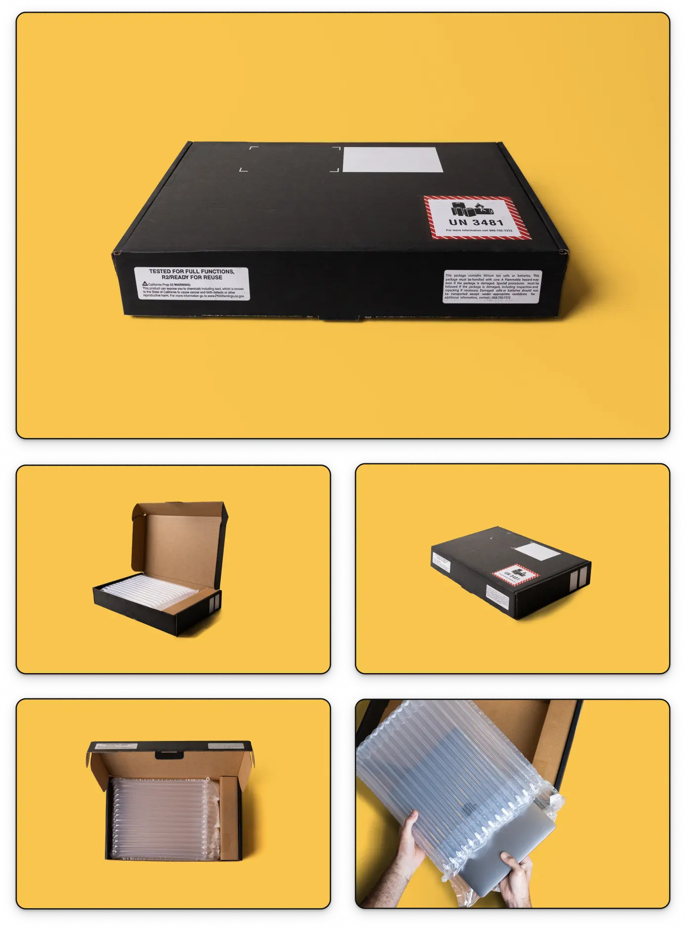
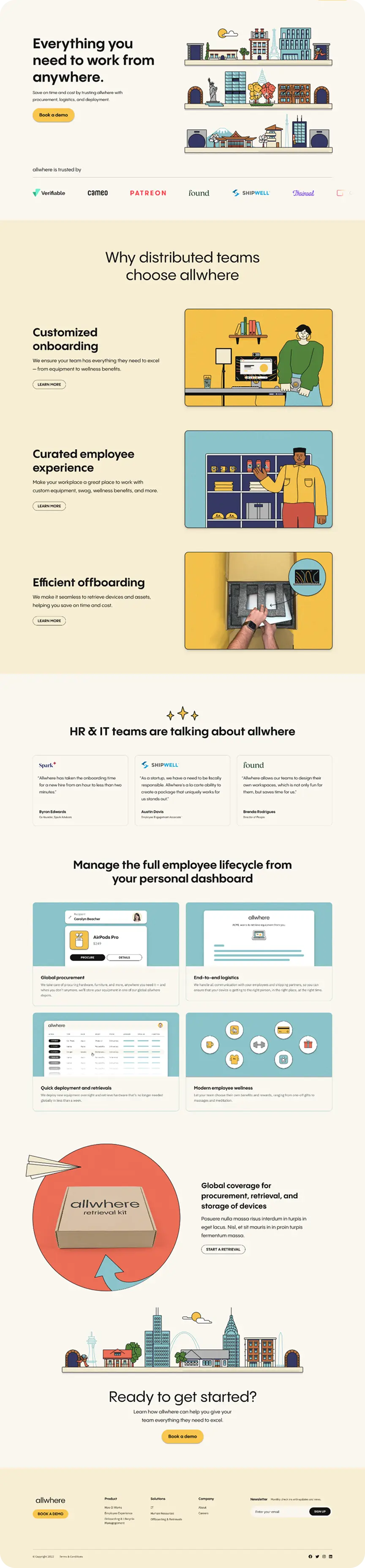
Great design is about more than polish—it’s about making the complex feel simple. We redesigned the offboarding flow to feel like an e-commerce checkout, complete with product photos of their retrieval kit and clear step-by-step instructions. Throughout the site, we used a mix of real imagery and playful illustrations, refined the mobile experience, and elevated CTAs to feel more delightful. The result was a site that feels as thoughtful and useful as the Allwhere product itself.