Fuel for the Fire: A Titans Concept Rebrand from a Lifelong Fan
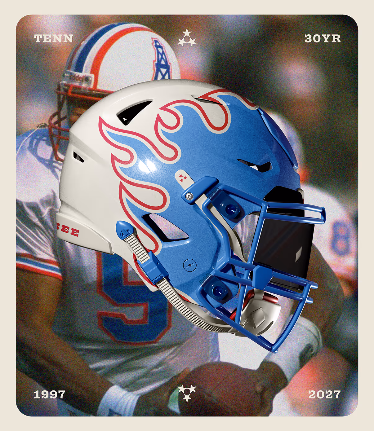
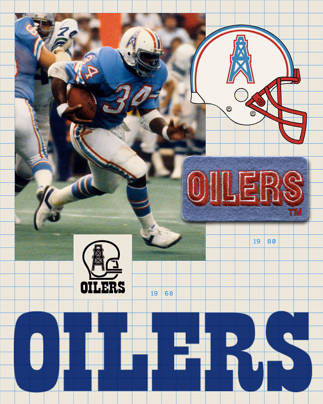
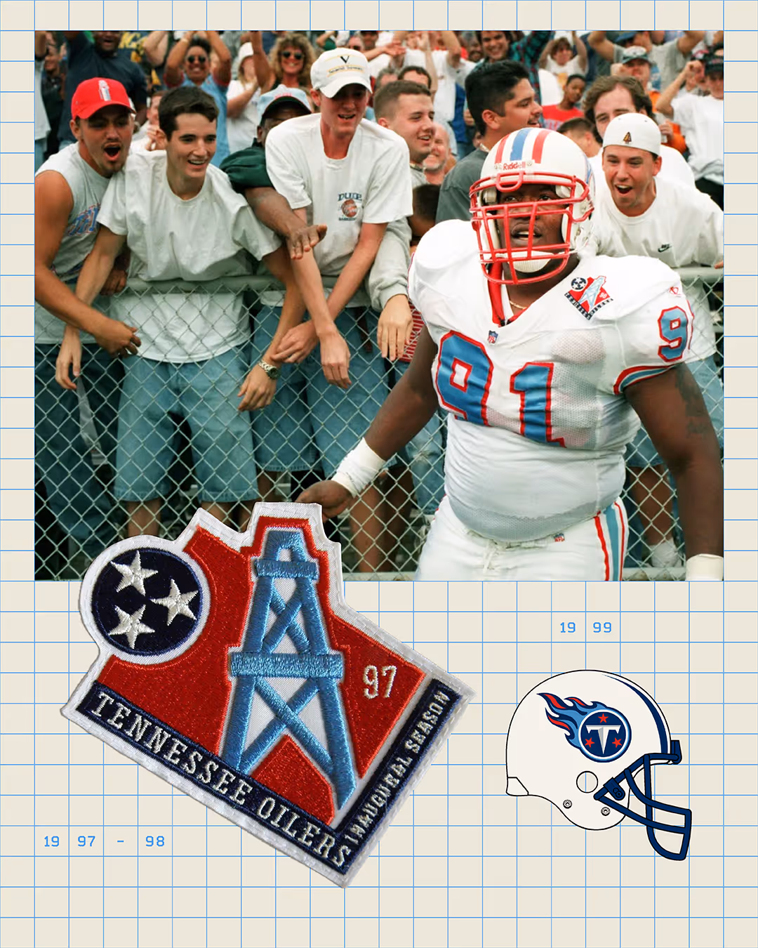
In 1997, the Oilers moved to Tennessee. As a kid in those early formative years of football fandom, I couldn't believe my luck—my city was home to an NFL team.
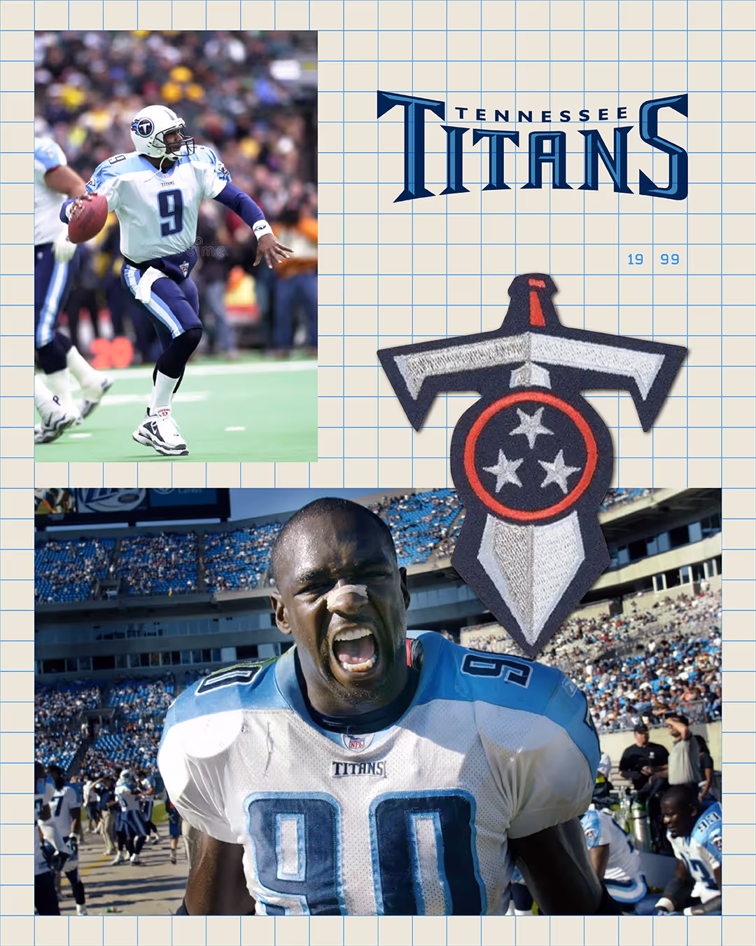
The "Tennessee Oilers" felt unreal, but when they rebranded as the Titans two years later, the shift felt cinematic. The fire. The sword. The energy. It felt like we were forging a new legacy from scratch.
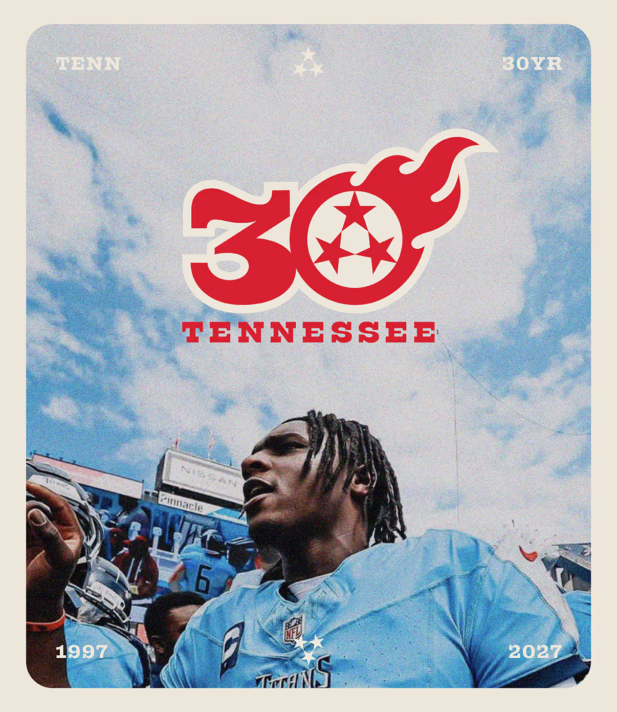
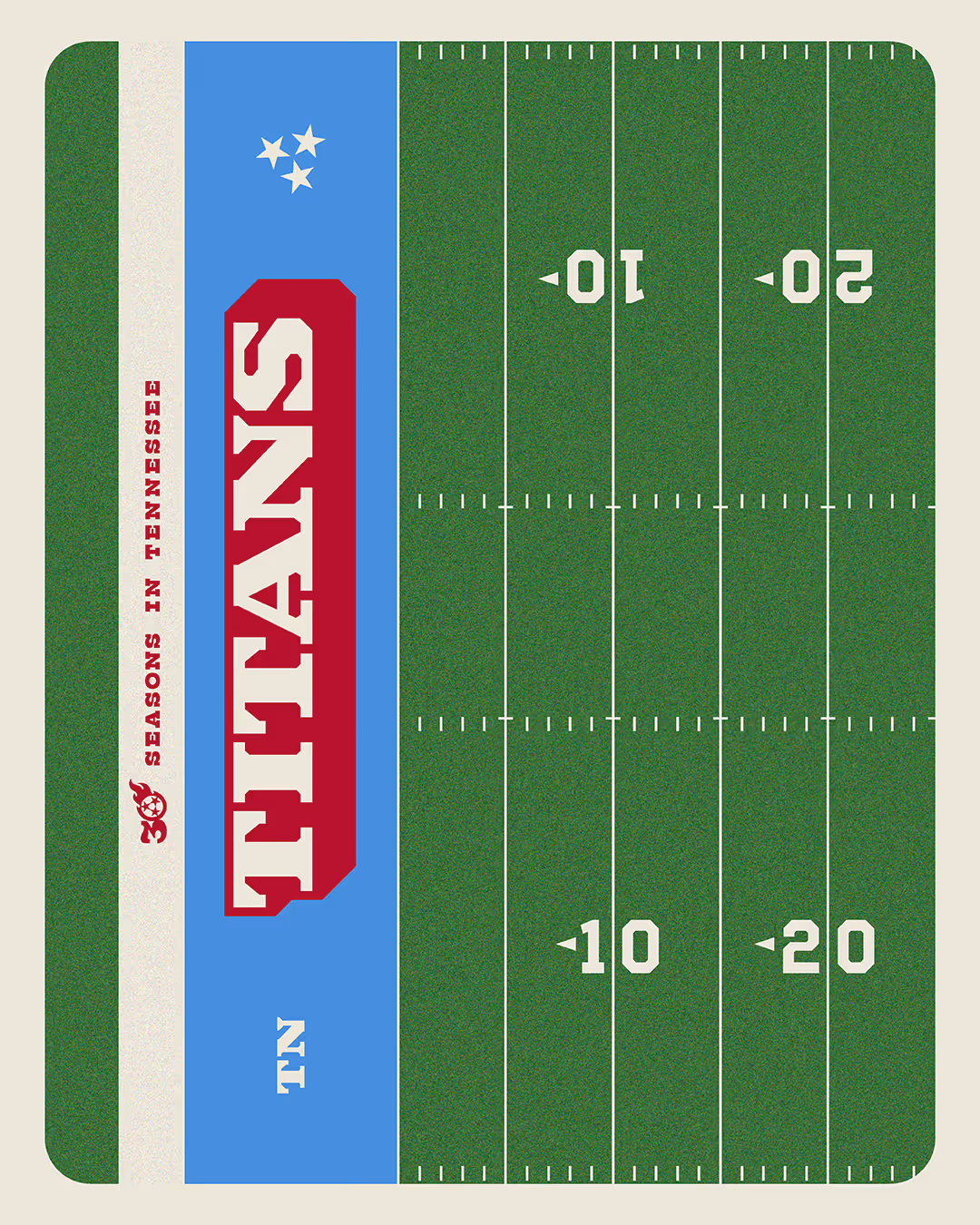
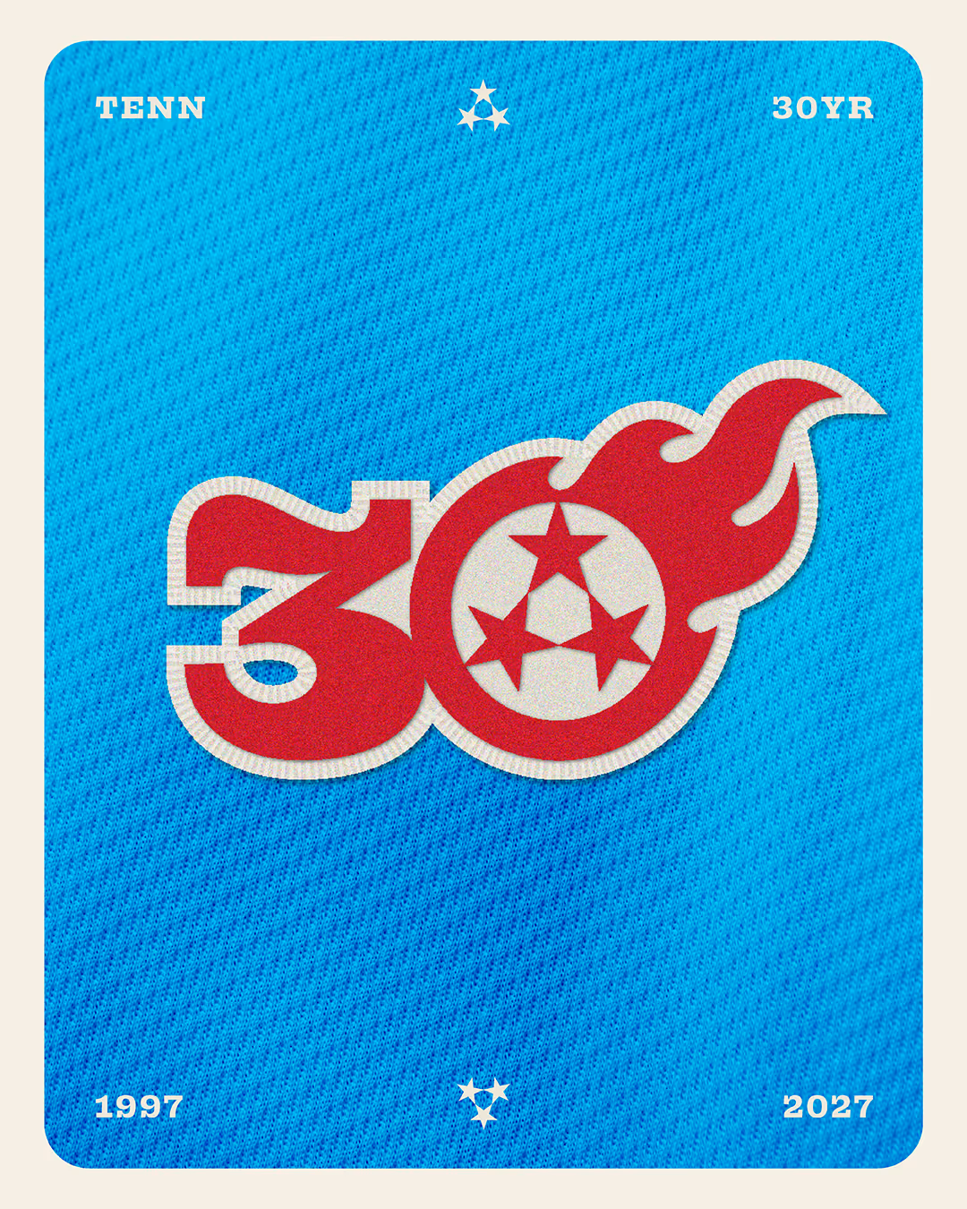
Next year marks 30 years of NFL football in Tennessee. As the team prepares to step into a new stadium, we are facing a rare franchise milestone. It’s a moment for a reset—a refinement—and a chance to retell our story.
So, I started designing.
To be clear: This wasn't commissioned. The Titans didn't ask for this. This is pure fandom. This is what happens when you grow up loving a team and happen to have an obsession with brand systems, typography, and uniforms. This concept has been rattling around in my head for a while now.
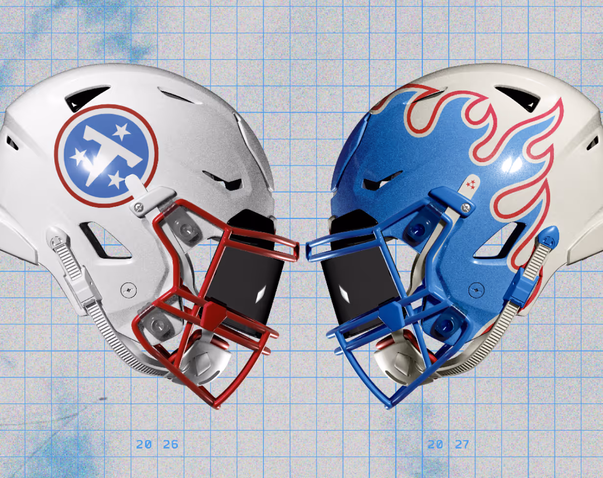
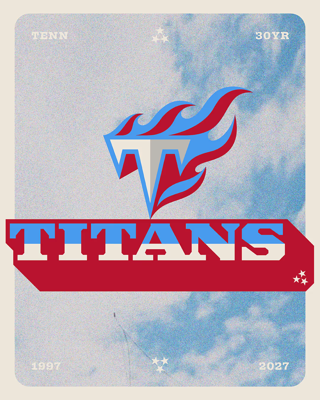
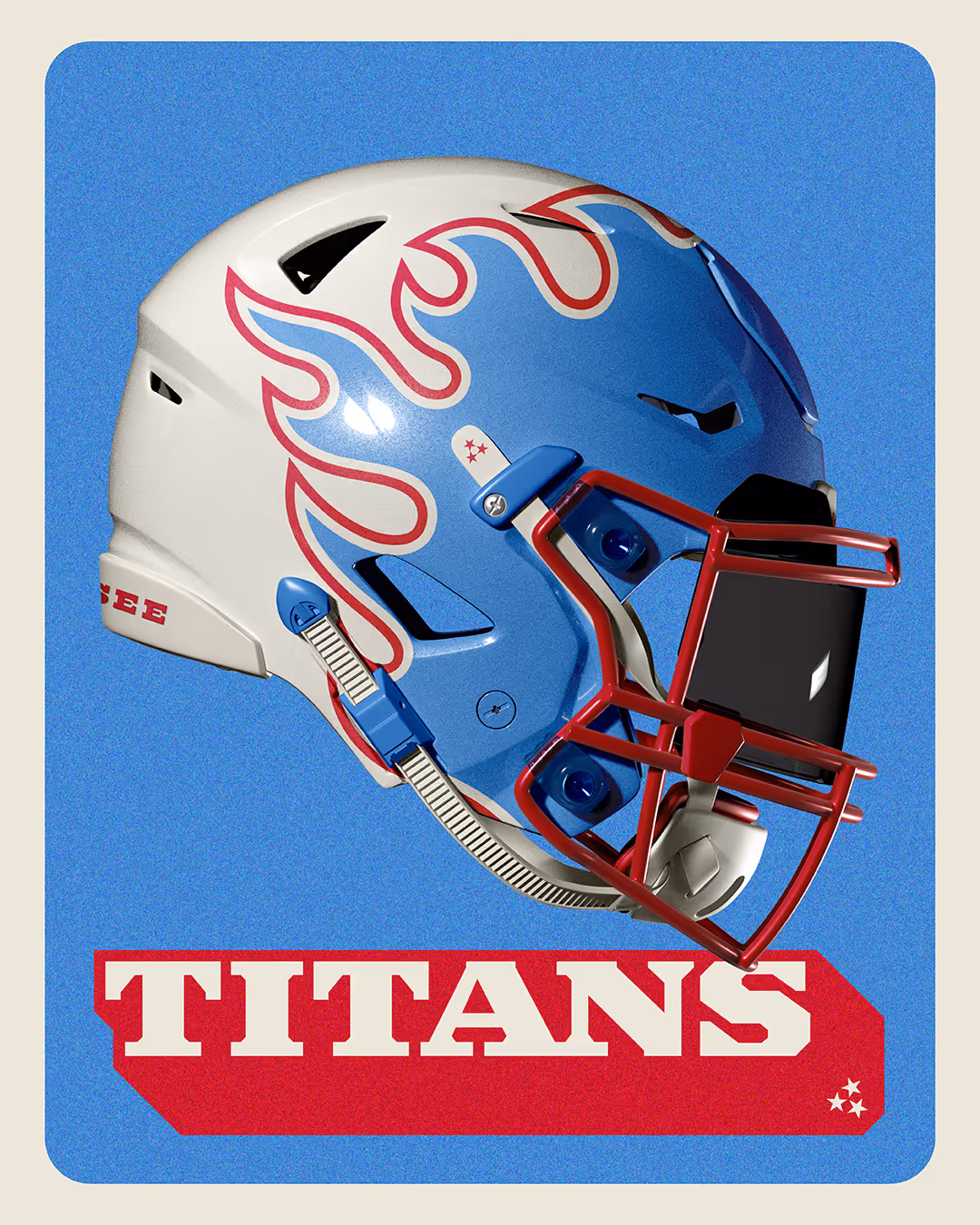
THE FLAMES MATTER
Sports brands should have personality, electricity, and swagger. They should feel alive on a helmet streaking down the field under Sunday night lights.
The recently leaked creative direction for the franchise didn't feel that way to me. It felt restrained. Safe. It felt like the fire was going out, and I’m not ready to see the fire die.
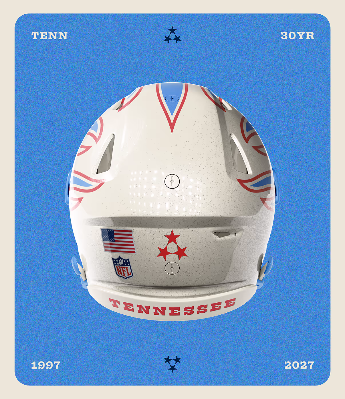
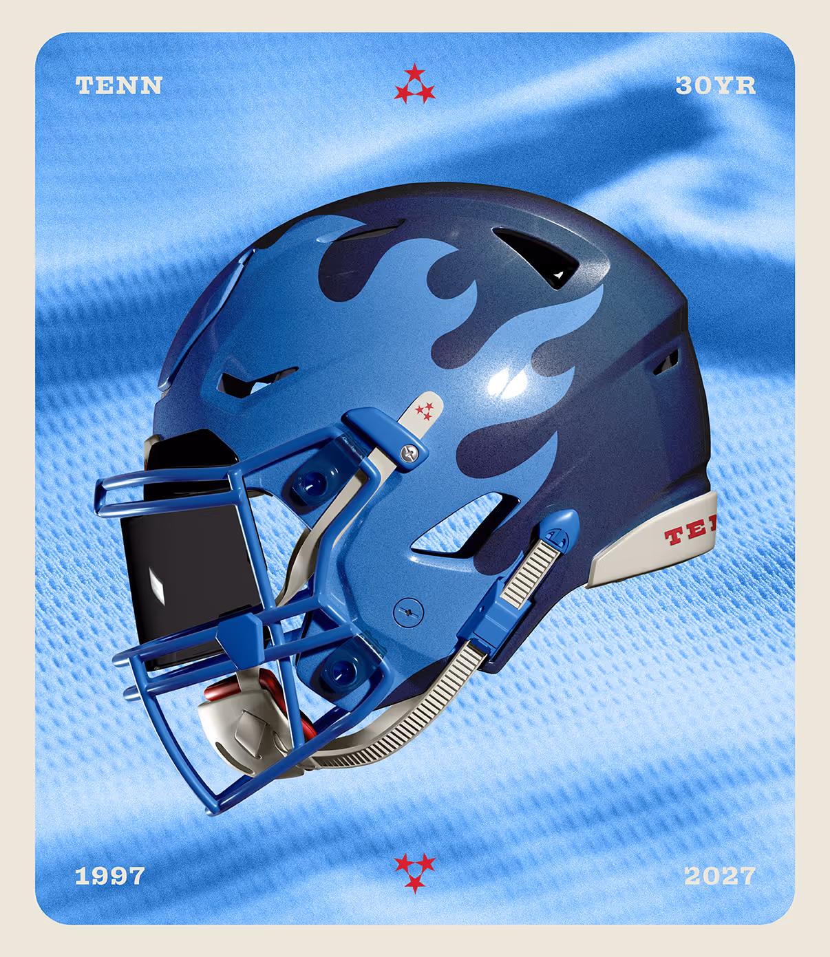
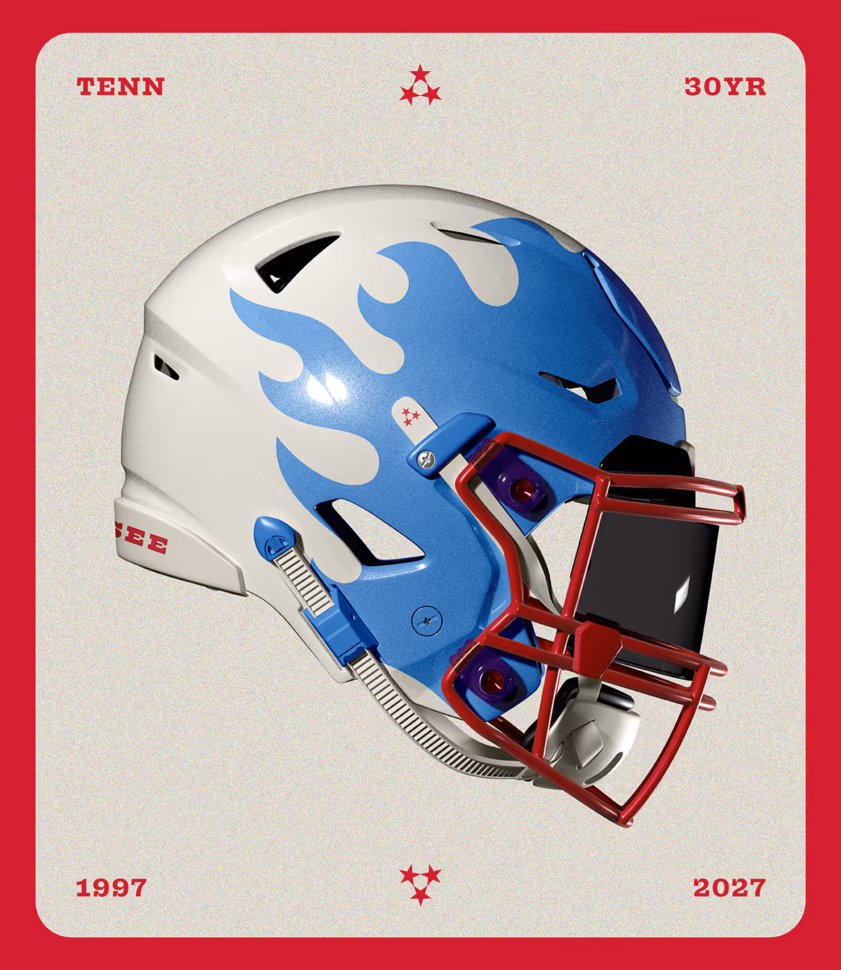
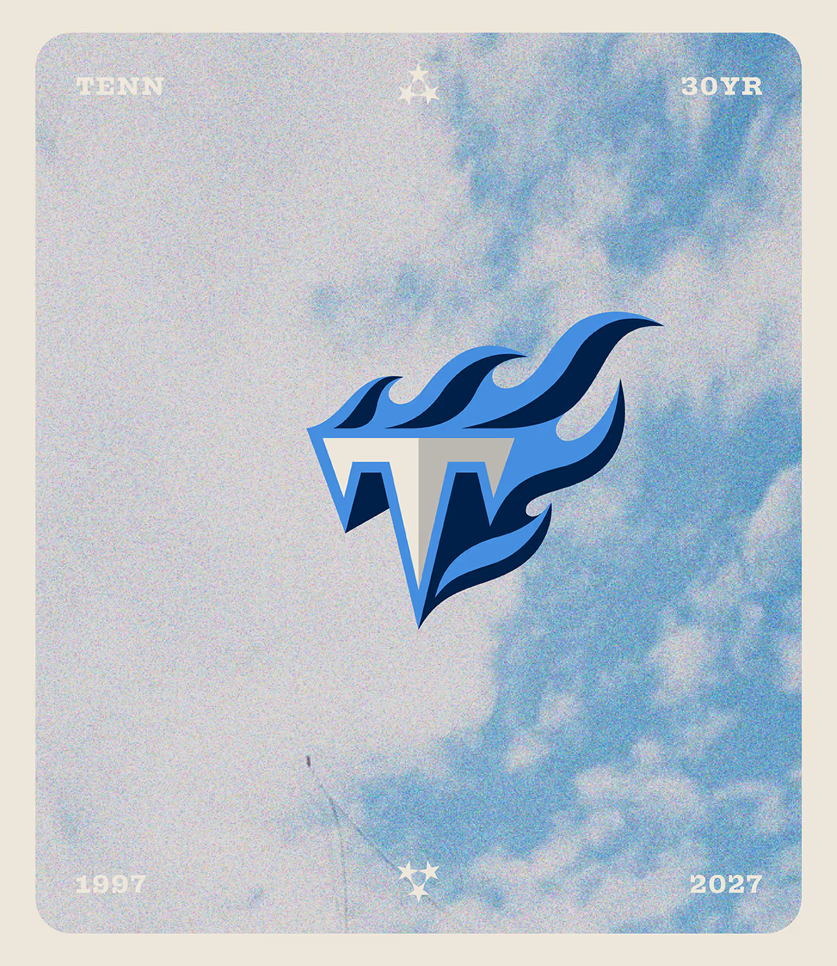
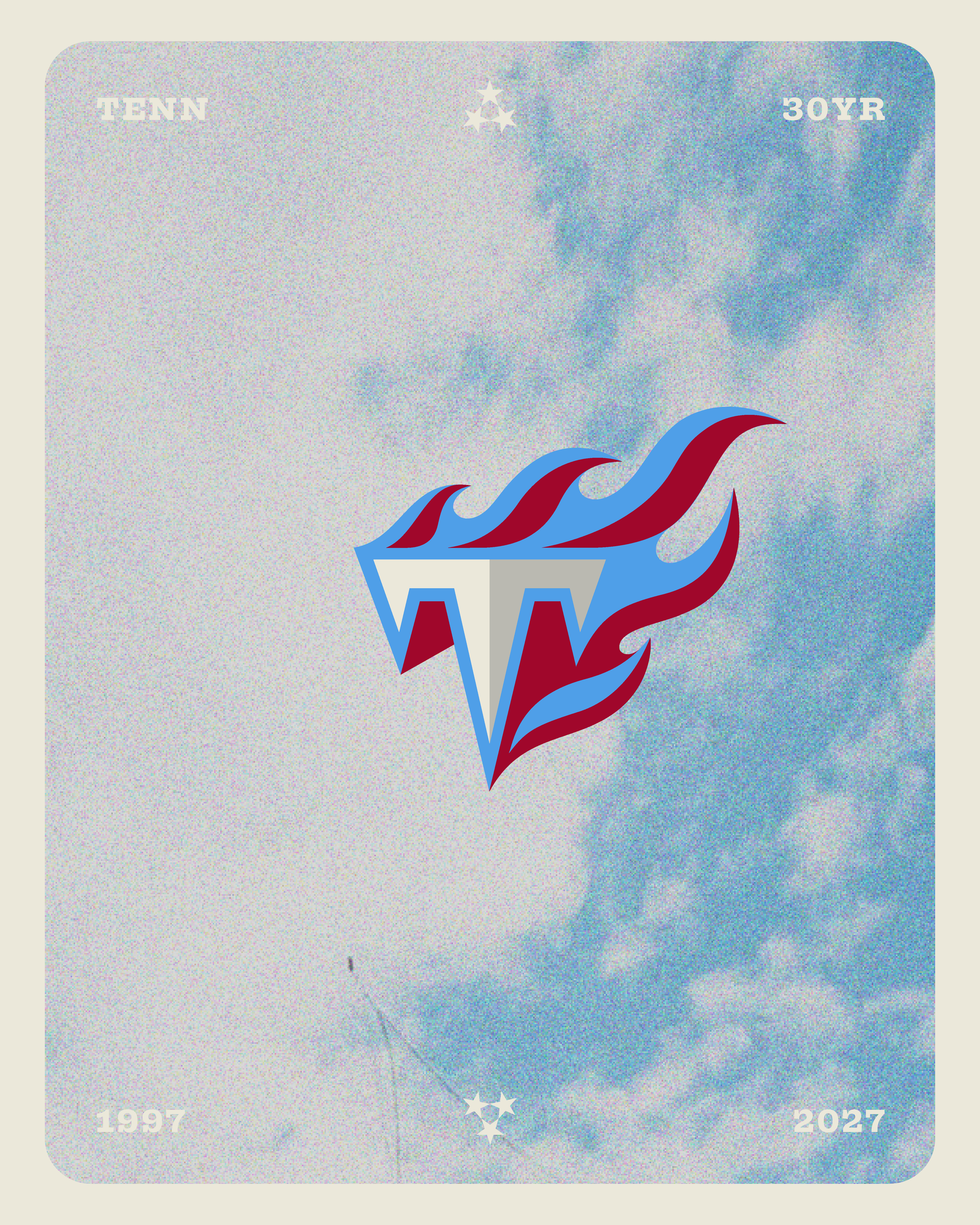
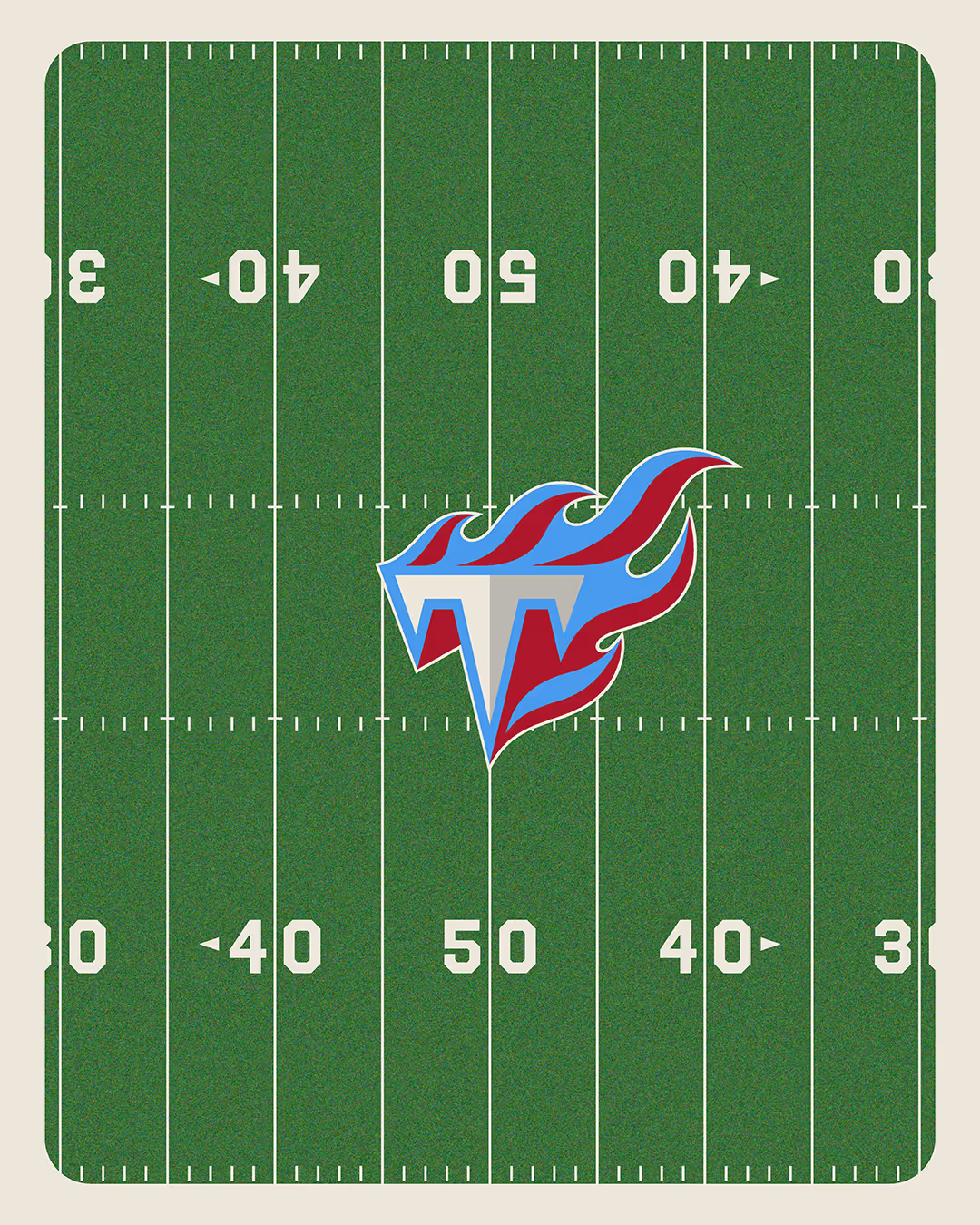
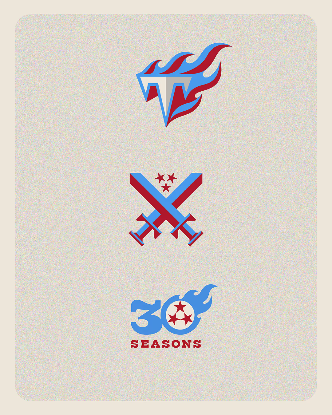
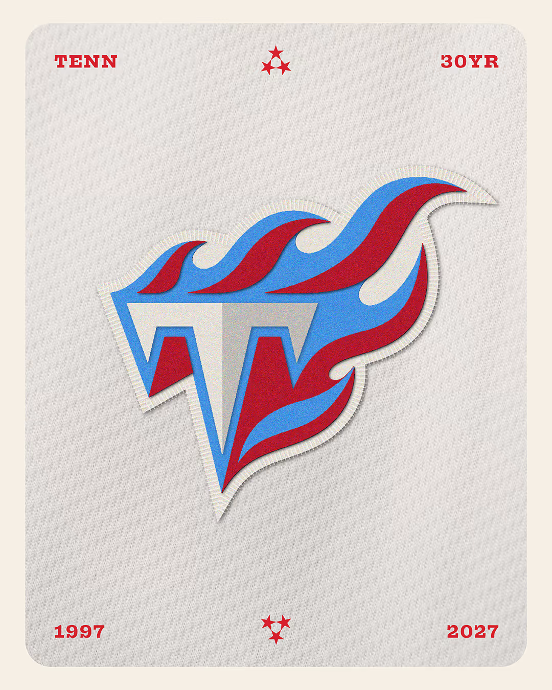
The Titans' flames are one of the most iconic, "ownable" motifs in the NFL. Very few teams possess a visual element that is so distinctly theirs.
Admittedly, I never loved the exact execution of the original logo; it was busy and very "late 90s." But it had drama. It had motion. That fireball streaking across the sky felt mythic.
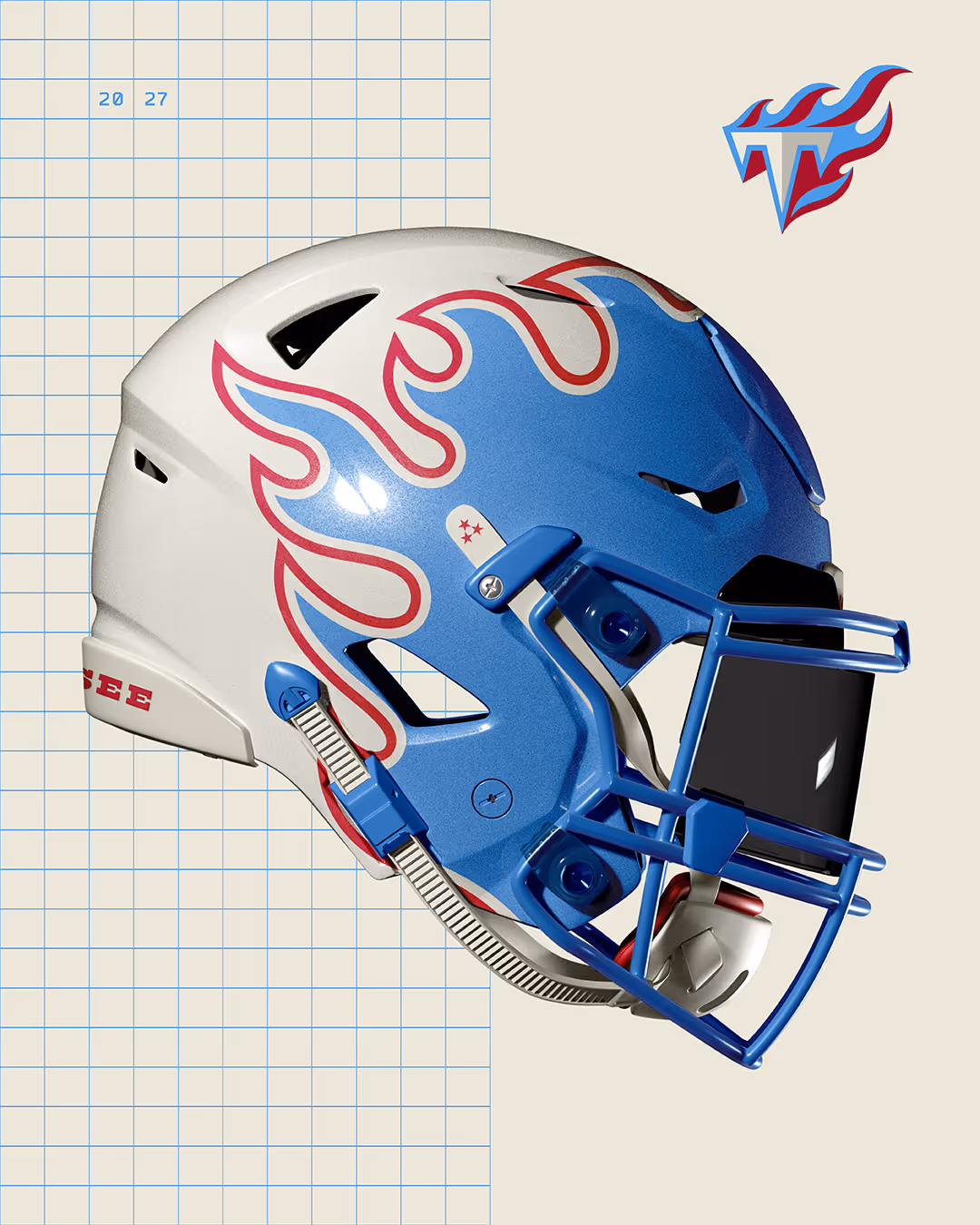
In this concept, I preserved that spirit while sharpening the execution. I focused on balanced forms with energetic motion, crafting a cohesive and dynamic visual system. Here, the fire isn't decoration, but a structural element of the brand.
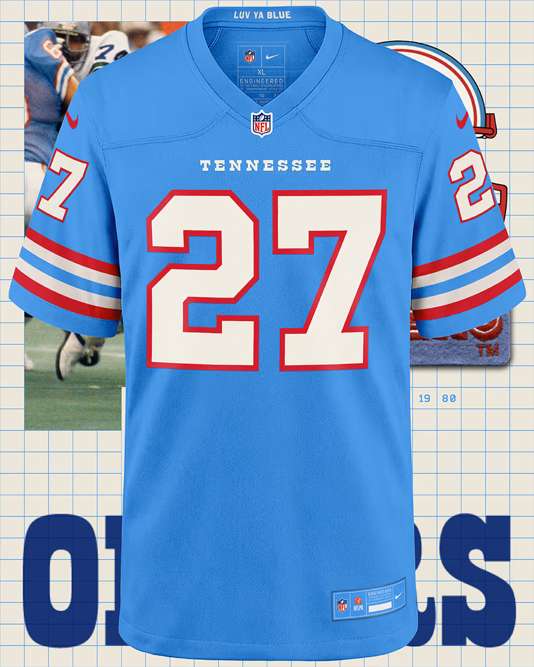
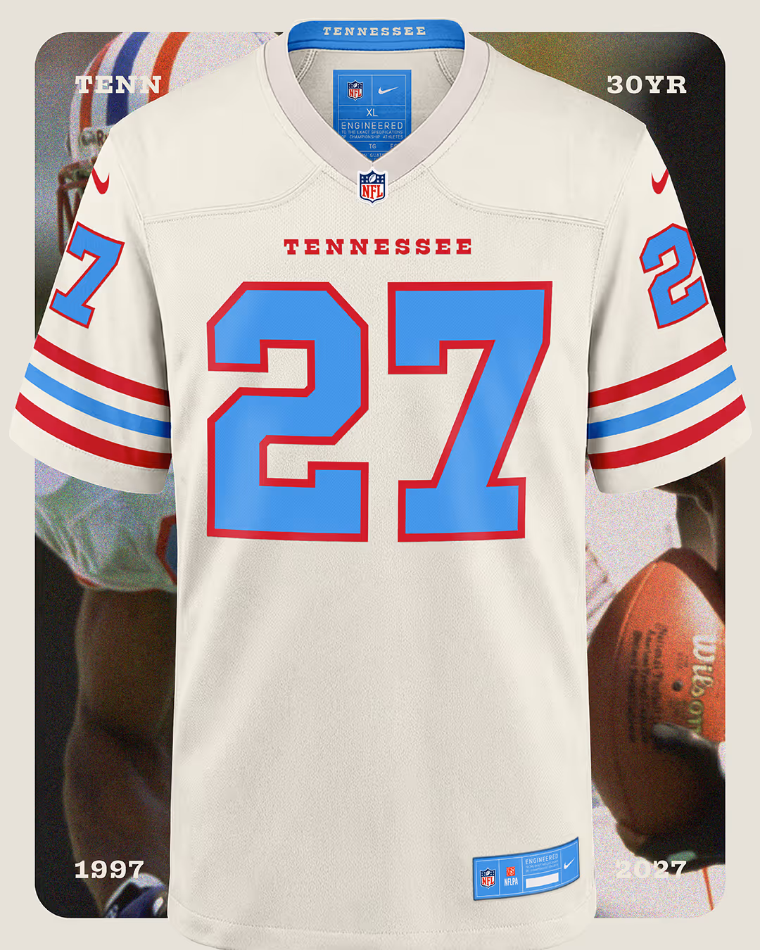
COLUMBIA BLUE IS FUEL, NOT THE DESTINATION
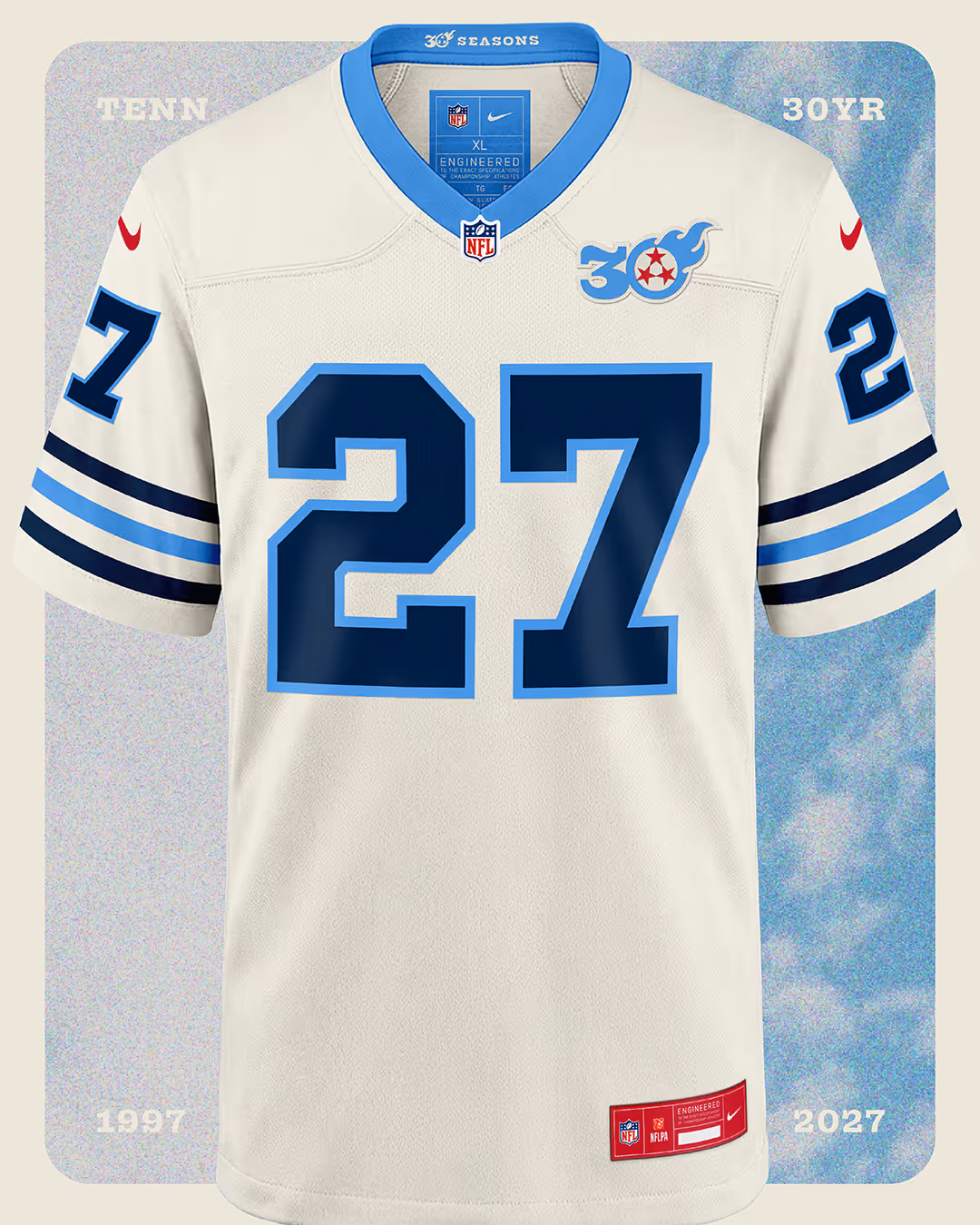
Leaning back into Columbia Blue is a great move. That color connects Tennessee’s football history in a powerful way. However, it would be a missed opportunity if the Titans ended up looking like a knockoff of the Houston Oilers.
In my rebrand, the classic Oilers kit is the fuel, not the finish line. The prominent blue and classic striping logic anchor the system in heritage, but the Titans' mythology takes over from there. The result is unmistakably Tennessee: a modern identity built on history, not constrained by it.
What I’m sharing is a glimpse into a full ecosystem:
- Helmet Explorations: Pushing the flames to become iconic again.
- Dynamic Badges: Creating flexibility for merchandise, midfield marks, and digital platforms.
- Custom Typography: A wordmark system that brings the weight and structure the current identity lacks.
This is how I view sports branding. It’s not just one mark; it’s how the uniforms, social graphics, and stadium atmosphere work together to create an emotional response.
SAY IT AIN'T SO
When I saw the rumored leaks, my first instinct was simple: Say it ain’t so.
Thirty years in Tennessee deserves more than a quiet refresh. It deserves conviction. It deserves a visual system as electric as a Sunday in Nashville. This work isn't criticism for the sake of it; it’s love expressed through pixels.
I’m a Titans fan, and I believe the fire should burn brighter.


The Cultural Signals Canvas: Finding Opportunity in a Shifting Landscape
The Future Belongs to the Embodied